Creating great maps needs great data. Depending on what we're trying to visualize, we might find that we're missing a key attribute, or that the data we need is in a different dataset. This tutorial will show you some GIS magic to get a count of markers in a county and create a stunning quantity map for your online GIS.
Sometimes it just all comes together and we’ve got everything we need to make a great map: we’ve got a spatial file with our points, and we’ve got a spatial file with our regions. Let's say points are all the colleges and universities across the US, the the polygons are all the counties in the US.
Adding them both to a web map will give us two layers. From the point markers we can see that some counties have lots of colleges, some have fewer. Great. Now, say we want to shade each county by the number of colleges. We’ll just go to the layer style settings for the counties and select the points and… wait. The points aren't in the county layer, so there's no way to create a choropleth map showing the quantity of schools per County. So how can we do this?
To create a quantity web map, we need a numerical column in the County data that lists the schools per county. In a spreadsheet, this would be simple enough - just copy the entire count column from the college spreadsheet, and paste in the County spreadsheet.
But when dealing with spatial files, it's not quite that simple.
Lucky for you, we've written a step-by-step tutorial [ jump to the tutorial ] to run you through the whole process of merging data from one shapefile into another, so that we have the required quantity data to create an online choropleth map.
What is a Choropleth map?
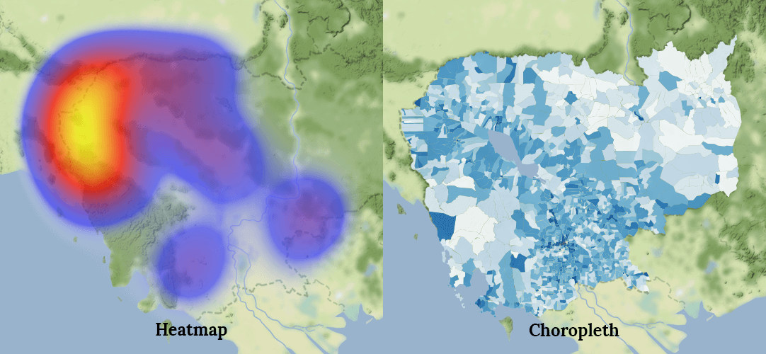
Sometimes choropleth maps are referred to as "heat maps". Now this isn't strictly true.
Renowned cartographer Gretchen Peterson, has a succinct definition:
A choropleth map shows a change across a geographic landscape within enumeration units such as countries, states, or watersheds. A heat map shows a change across a geographic landscape as a rasterized dataset–conforming to an arbitrary, but usually small, grid size.
In visual terms, the difference is quite clear:
What we'll be creating today is an online Choropleth map, sometimes referred to as a Quantity map.
In this tutorial, we’ll cover the following:
1. Importing the spatial data into QGIS
2. Calculate the number of points in each county
3. Clean up the data
4. Create an online quantity map of colleges per county
The Data
To create our quantity map, we’re going to be using two datasets:
- The first is US colleges (point data) which contains the locations of all US schools.
- The second dataset is US counties (polygon data).
The objective is to create a "heat map" that lets us see which counties have the highest number of colleges.
The data is in Shapefile format which is the de facto standard for sharing map data. Despite its singular name, it is in fact a collection of files – with a minimum of four key files: (.shp, .shx, .dbf, .prj).
If you have your own location data in a spreadsheet you can follow this tutorial that explains how to convert a spreadsheet into a Shapefile.
You can easily find Shapefiles for different administrative boundaries for free online. For example, the administrative boundaries for the U.S can be downloaded from the Census Bureau.
The Tools
We will be preparing the data using a popular open source GIS (geographic information system) program called QGIS. If you don’t already have QGIS, download it now. It’s completely free, and is a great platform to continue learning about mapping and GIS.
Don’t worry, you don’t need to be a QGIS expert to complete this tutorial. However, if you would like to learn more about it, then here is a great place to get started.
For this tutorial, we’re using QGIS 2.18, but it should also work much the same on earlier and newer versions.
Let’s get started!
1. Importing the Spatial Data into QGIS
First unzip the sample data you downloaded and save it in a local directory. You will see there are two Shapefiles: Colleges and Universities, and US Counties.
Now we need to open QGIS and complete the following steps:
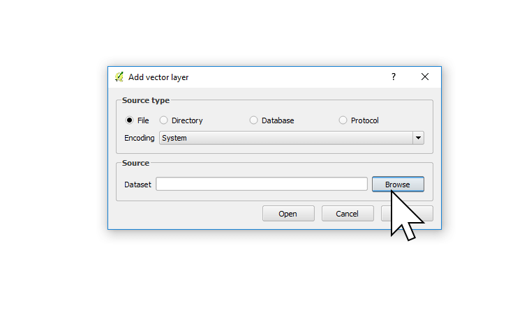
1. From the left toolbar, click on the Add Vector layer icon.
![]()
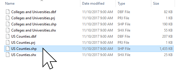
2. Press the Browse button and choose the US Counties.shp file and press Open.
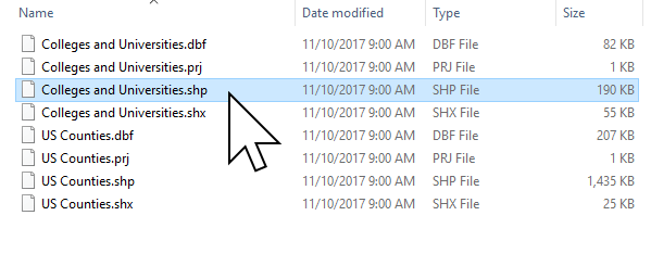
3. Repeat steps one and two, and open the Colleges and Universities.shp file.
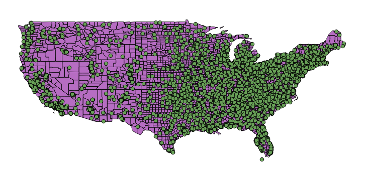
4. Now we can see the two datasets displayed on the map as layers.
A Shapefile is made up of two main parts, the first is the geometry which you can now see on the map, the second is the attribute data which contains data about each feature.
Let’s take a look at the attribute data for one of the Universities.
5. Activate the Identify Features tool, found on the top icon bar.
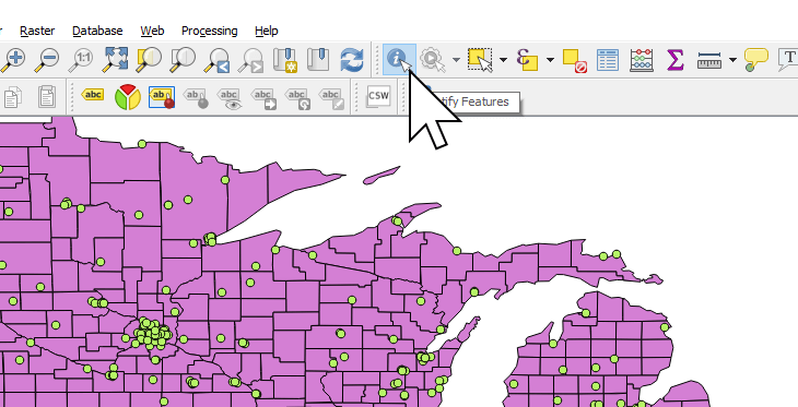
6. Click on a feature on the map to reveal the attributes.
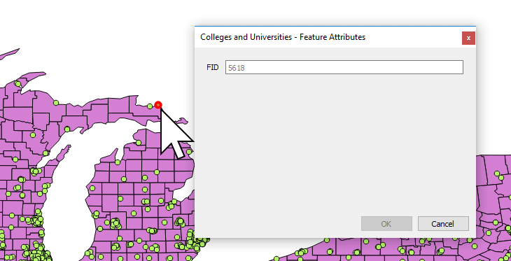
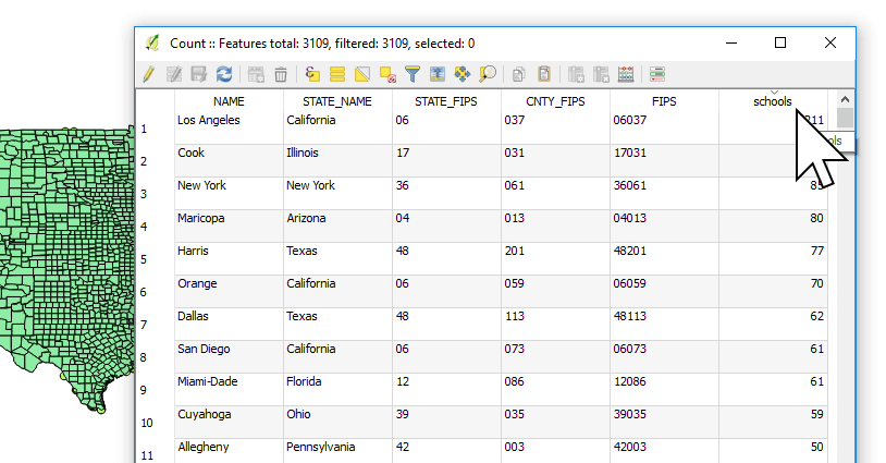
We can see that the Universities data we're using doesn't contain any information besides an FID, a unique number assigned to each location. We're only interested in using the location, so we don't need any other data.
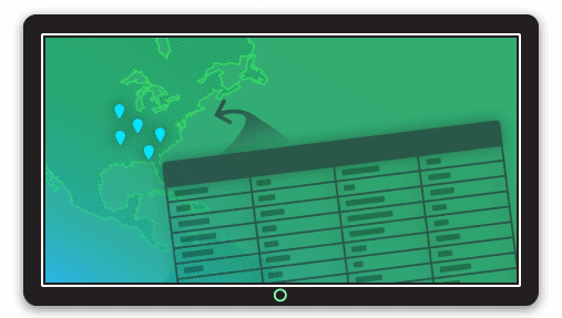
We're now going to use these location points and find out how many there are in each County.
2. Counting the Points (colleges) Inside Each Polygon (Counties)
As you can see from the points on the map, there’s a huge number of Colleges and Universities across the US. Some counties have dozens, some have none. Obviously, counting all of the points manually would be very hard work.
Thankfully, QGIS can do the hard work for us!
We’re now going to use QGIS to count how many colleges are in each county, and add that number as an extra column called “PNTCNT” in the attribute data of each country.
1. In the main menu press Vector → Analysis Tools → Count points in polygon.

The Count points in polygon feature will attempt to automatically add our polygon and point layers. If you had more layers active in QGIS, you would need to select the correct layers.
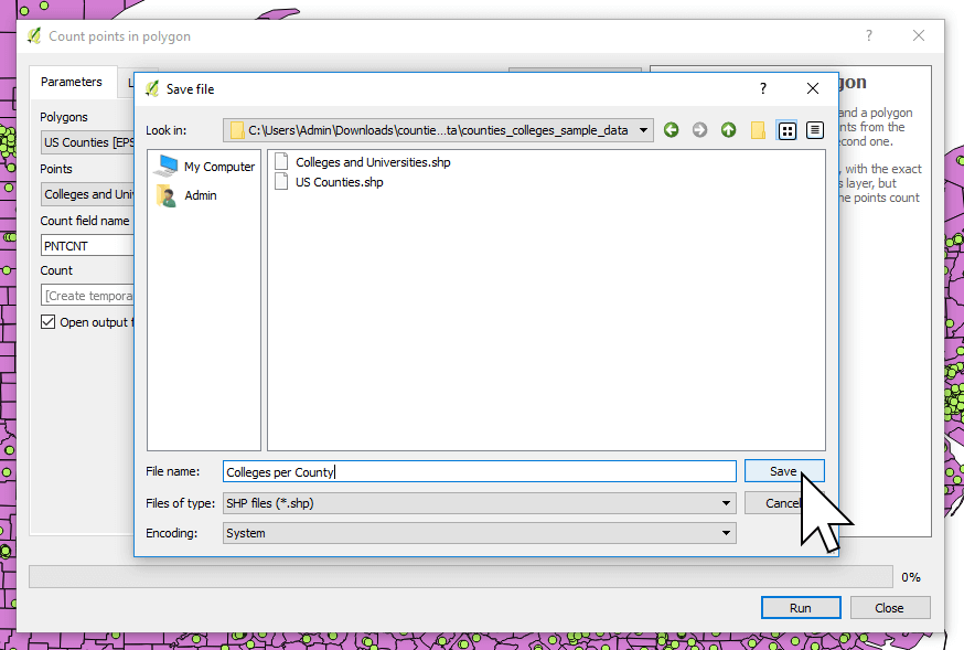
2. In the Count field name field, type PNTCNT.
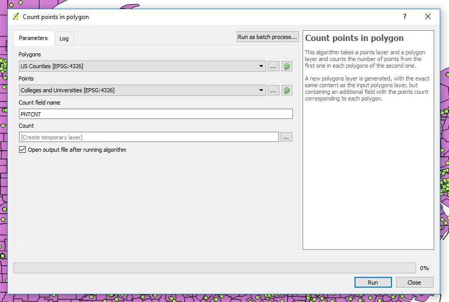
3. On the Count row, click the three dot icon and select Save to file...
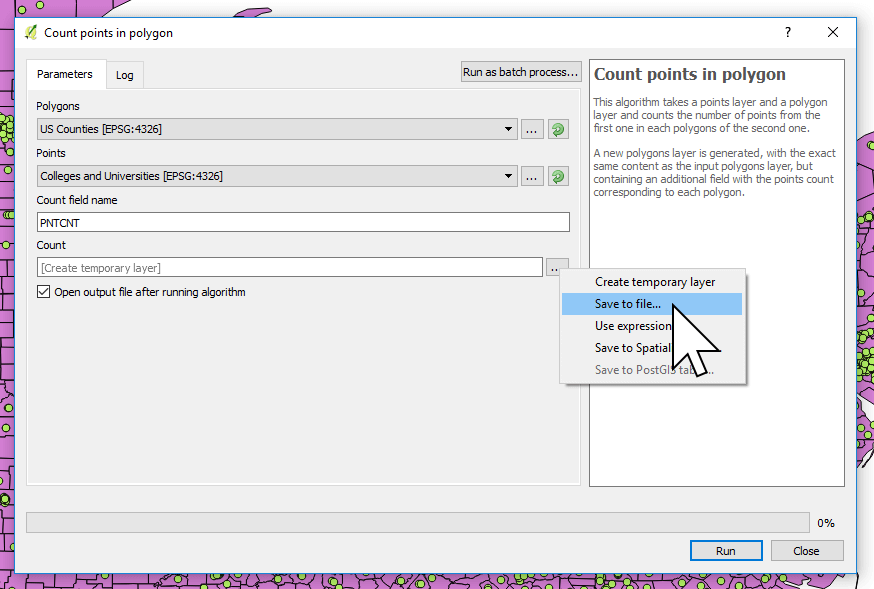
4. Browse to a location to where you want to save the Count results set the File name to Colleges per County. Click Save, then click Run.
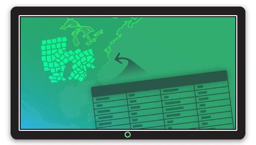
QGIS will calculate the number of points per county. When complete, a new map layer will appear on screen.
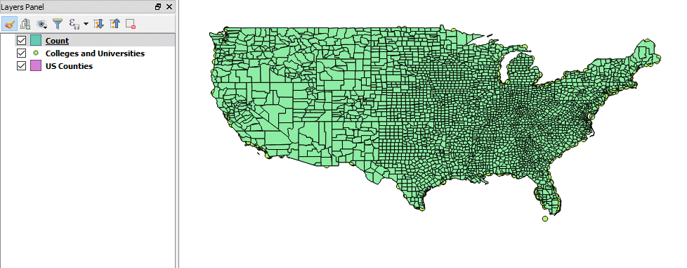
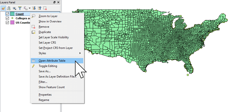
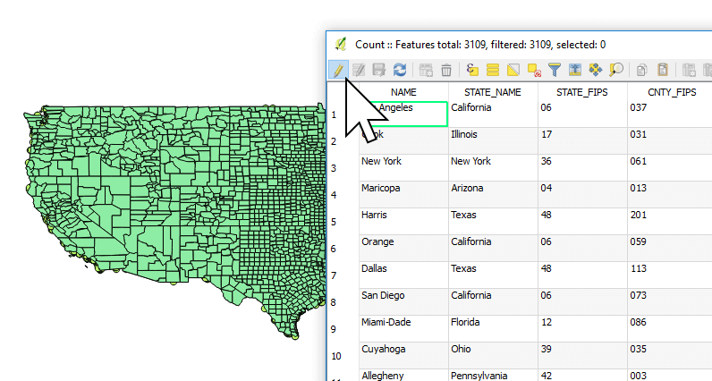
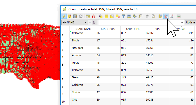
5. In the left hand to Layers Panel, you can now right click on the new layer “Count”, and select “Open Attribute Table”.
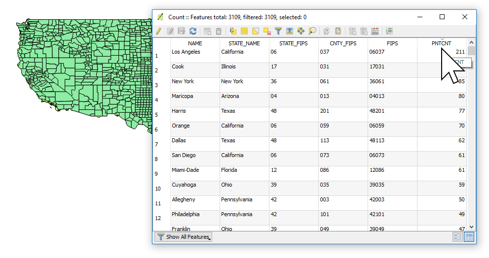
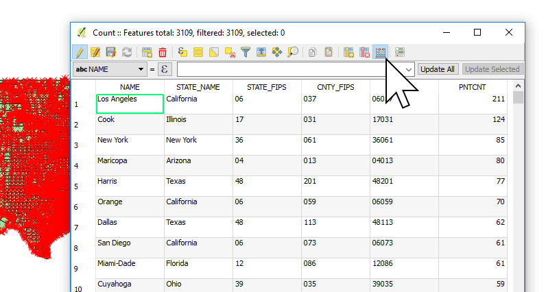
Here in the “PNTCNT” column we can see the number of schools in each county. Mission accomplished!
3. Data Clean Up
We’re almost done, but before we create our online quantity map, we’ll need to adjust the PNTCNT column we just created.
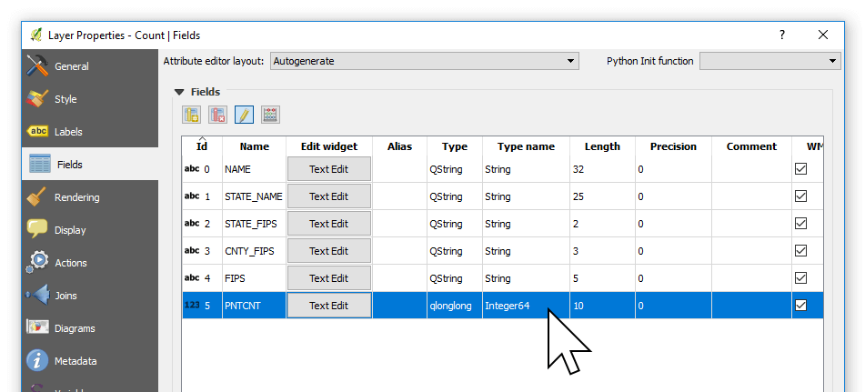
If you open the Count layer properties, you find that “PNTCNT” is a 64 bit floating point integer, as indicated by the Type name Integer64.
What we need for our web map is whole number, a plain old Integer.
Let's change it now. To fix this we need to convert the field to whole number using the Field Calculator.
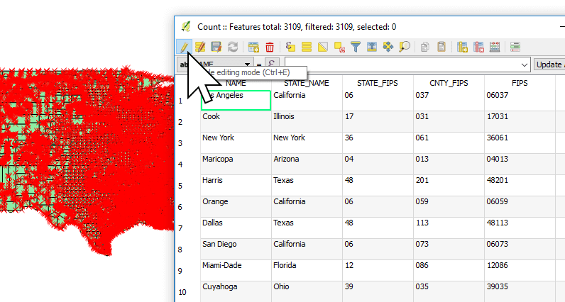
1. Return to the attribute table by right click “Count” and choose “Open attribute table”.
2. Press the Edit mode button - it looks like a pencil - from the top menu bar.
3. Now press the Open field calculator button - it looks like an abacus - from the top menu (Or press CTRL+ I).
4. Change Output field name to schools.
5. Make sure Output field type is “Integer (whole number)”.
6. Select Fields and values from the functions list, and double click on PNTCNT. You’ll see “PNTCNT” appear in the Expression window.
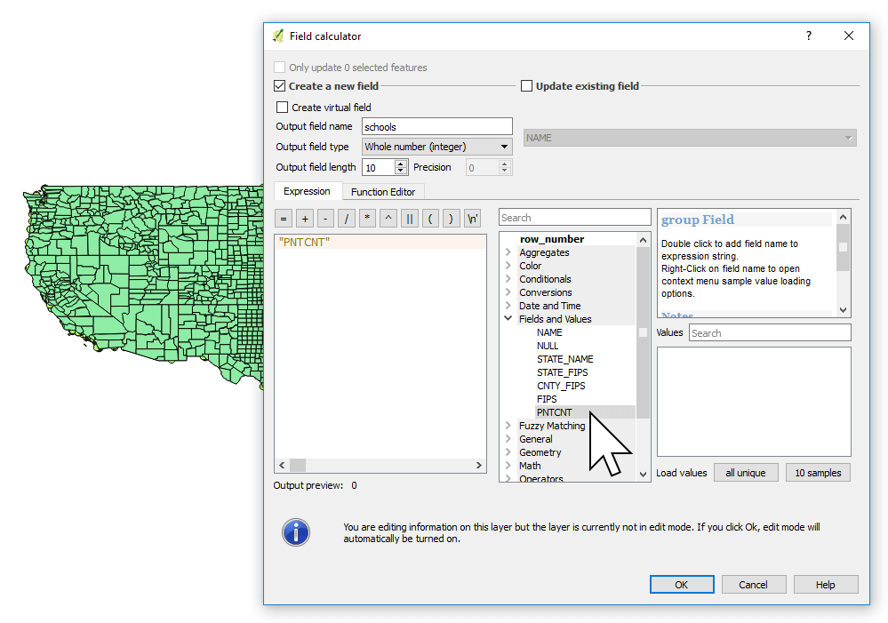
7. Press OK.
You will now see a new column called schools. The values might look the same, but they’re now in the format we need.
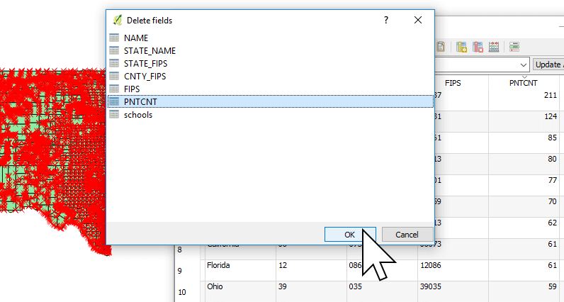
8. We can now delete the PNTCNT column by pressing the “Delete columns” button - it's the red column icon with the 'x' - in the top menu bar or pressing Ctrl + l.
9. Now select PNTCNT and click OK.
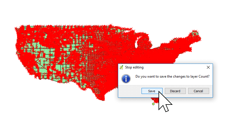
10. We should finish up by pressing exiting editing mode by clicking the pencil icon, or pressing Ctrl+E on your keyboard.
11. QGIS will prompt to save changes. Click Save.
Exit QGIS and head over to Mango.
4. Creating Our Quantity Map in Mango
We’re going to create a choropleth map. In Mango, we call this type of map a Quantity map for the sake of simplicity.
Now that you have your Shapefile, let’s upload it to Mango and take a look. If you don’t yet have an account, you can sign up for a 30-day free trial here.
Once you have signed in to your account, we’re ready to make a map!
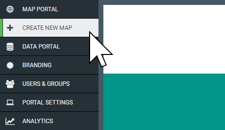
1. Press the “CREATE NEW MAP” button in your administration sidebar
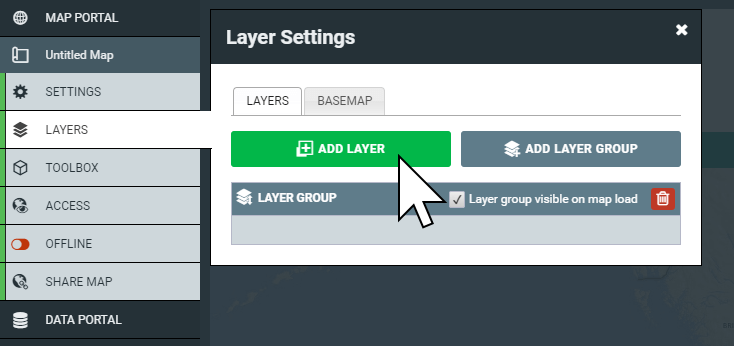
2. When your map is ready, click “LAYERS”, then click on the “Add Layer” button
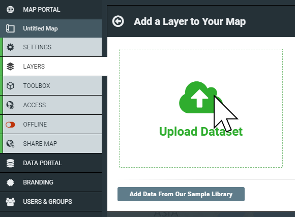
3. Now click on “Upload Dataset”
4. Here you can select the type of data you want to upload. We’ve got a Shapefile, so we don’t need to change anything. Click on Select files.
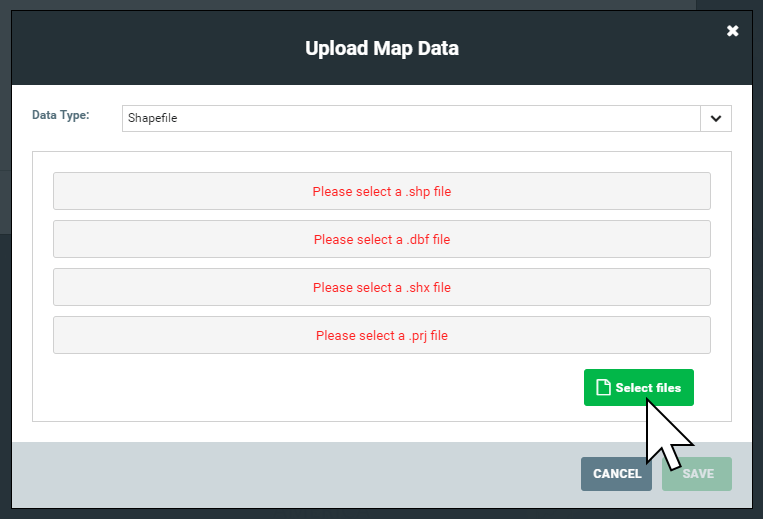
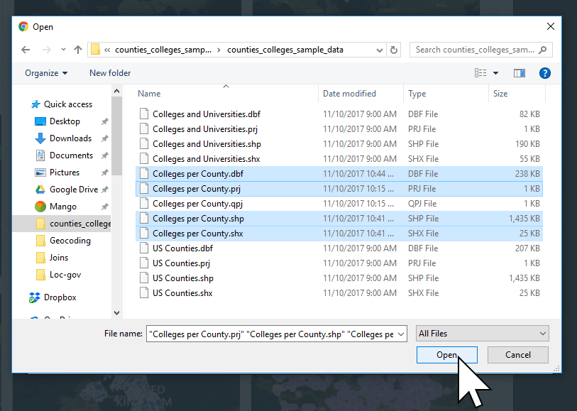
5. Navigate to the output location of our Colleges per County Shapefile, and select the four files of the Shapefile generated by the geocoder and upload them to Mango. To select multiple files at once, press and hold Ctrl and clicking each file (⌘ + click for Mac).
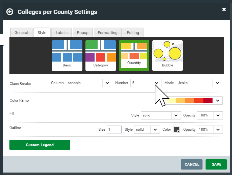
6. Once the upload finishes choose “Quantity” in the layer style panel.
7. In the Class Breaks row, select Column “schools” and set Number to 5.
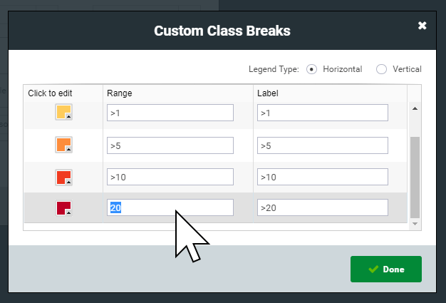
Click the green Custom Legend button at the bottom of the panel and change the Range column in the table to 0, 1, 5, 10, 20.
Press Done, the press Save on the Layer Settings panel.
You will now be able to see your quantity map.
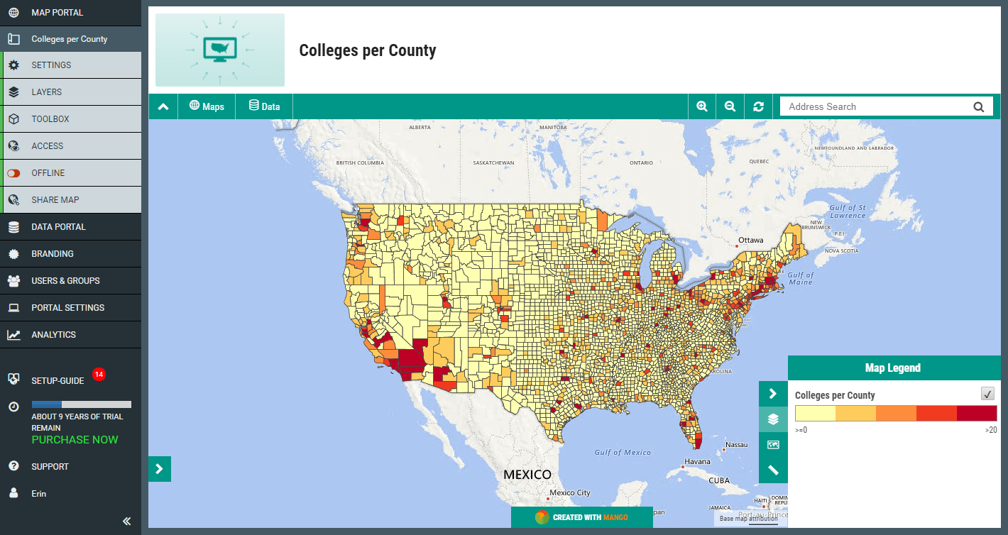
Nice work!
It’s a simple process, yet reveals a fascinating web map visualization. We can see large swathes of the US aren’t services by any universities or colleges, instead, they are clustered around the larger population areas on the east and west coasts. Sometimes, quantity maps can serve to reinforce existing understanding, or to reveal new understanding about the physical geography of our society. This same process can be applied to many types of data for your business or organization.
Returning to the Layers panel, you can experiment with different custom Class Breaks, to see how minor changes in how the data is classified will result in big changes on the web map visualization.