Spreadsheets can be fickle beasts. We’ve all use them, we all kind of know how to use them, sometimes we even love them - but are we really getting the maximum value out of them?
If you’re not a tabular wizard who can massage the data into just the right chart, or the perfect subset of figures, it can all just look like so much noise. It's too easy to miss key insights and opportunities, and there’s nothing worse than leaving money on the table when it comes to business.
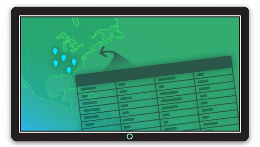
If your organization has any physical presence, you’re probably also collecting geographic data as part of your business intelligence, but extracting location based insights from static spreadsheets is a challenge.
Yes, you can create subsets of data by region or county, pivot sales data into regions, and binning data for charts that highlight sales trends, but trying to understand the physical geography of your data is often where we hit the wall. Lots of sheets, lots of figures, but not much actual insight.
Uncovering Hidden Insights
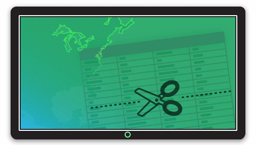
Much of this type of analysis is near impossible in a spreadsheet, and if you've spent time and money on collecting business intelligence, you know that extracting the right answers is a battle you can’t ignore.
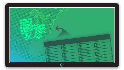
Thankfully, there’s a simple way to combine all that data you’ve collected in spreadsheets with existing spatial data to create maps that reveal actionable insights for your organization.
Say you have a spreadsheet containing some interesting data about each county in the US. Visualizing that data on an interactive web map will not only aid visual exploration of the patterns in the data, but also can be layered and enhanced with other business data such as sales data, franchise territories, expansion opportunities, or even data that might help mitigate risks to your business.
No matter what type of data you have, web maps provide superior experience, providing a visual context for business data analysis, sales mapping, real estate or territory mapping, or demographics within and around target geographies.
Create Online Map Visualizations That Deliver Rapid Insights
We’ve designed this tutorial to help achieve an insightful interactive web map that can be shared with anyone, on any device.
Online heat maps like the one you'll create in this tutorial are super accessible for end users - great web maps will work on any device, and can be easily shared and explored - unlike a spreadsheet which, simply due to screen size and complexity, really only work on desktops.
Combining two data sources together is called a join. You can perform joins on just about any two sources of data where the spreadsheet data contains at least one matching column that’s also found in the spatial data.
Creating a map of state names, county names, county codes, zip codes, region names... in fact, any administrative area can be combined with spreadsheet data into a new spatial file, ready to make brilliant interactive web maps.
All that’s required is that our spreadsheet contains at least once column with fields that match data so we can join our spatial data with the business intelligence and extract our spatial intelligence.
Spatial data + Business intelligence = Spatial Intelligence
Joins can be done quickly and easily using free tools, and you can apply this technique to many types of spatial data that is freely available online.
In this tutorial, we’re going to map U.S unemployment rate by county, which could serve as a useful reference map in all sorts of business scenarios from franchise territories, store locations, or job creation services to support strengthening communities with high unemployment.
In this tutorial, you’ll learn the following:
1. Understanding the data types
2. Loading spatial data in QGIS
QGIS is a free, open source desktop GIS
3. Loading spreadsheet data in QGIS
4. Joining the spreadsheet with the spatial data
5. Exporting the joined dataset as a Shapefile
6. Mapping the dataset
You won’t need to know how to use QGIS to complete this tutorial and create a web map. We’ll take you through everything you need to know, step by step. Online mapping is a great skill that can bring massive insights for your organization, so you’ll find that once you’ve made your first map, you’ll want to make more and uncover more hidden opportunities for your organization.
Tutorial resources
For this tutorial, you’ll need just two things:
- QGIS, which you can download for free here
- The sample data package we’ve prepared, which you can download here.
Install QGIS and unzip the sample data package. If you don’t have a compression utility to unzip the package, you can download WinRAR.
For this tutorial, we’re using QGIS 2.18. Earlier and later versions follow the same flow, but some items may be in different places in the interface.
Let’s get started!
1. Understanding the Data
The sample data contains five files:
data.csv, counties.shp, counties.dbf, counties.prj, counties.shx
data.csv is tabular data of U.S unemployment by county and contains two columns: “fips” (county code), and “rate”.
This CSV doesn’t contain any geographic coordinates so cannot be mapped on its own. This is the kind of data you might have in your own spreadsheets.
The remaining four files, counties.[shp/dbf/prj/shx] contain the county boundaries for the contiguous United States. Collectively, these files are known as a Shapefile. Shapefile is the de facto standard for sharing geographic data, and can be read by most mapping applications, including Mango.
You may come across other map data formats such as KML, Tab Files or GeoJSON, but Shapefile's are the most common and we will focus on those for this tutorial.
Sourcing other spatial data
Shapefiles with administrative boundaries for most countries and regions worldwide can be downloaded for free online, often via government data portals such as the Census Bureau. To find this Shapefile, we could just Google for “US county Shapefile” and we’ll find various sources for the data.
Learn more about sourcing spatial data here.
When sourcing spatial data to join with your data, it's important to remember that your data needs to contain at least one matching region identifier.
For example, a shapefile of census data might contain county fips codes, or it might contain county names. If your spreadsheet has county names, but the spatial file contains fips codes, you'll need to create a new column in your spreadsheet and insert the correct fips code for each record.
Disclaimer: The unemployment data contained in the supplied CSV is not guarranteed to be accurate. Always ensure you validate any data you source online for its accuracy and recency.
Pro Tip: Administrative boundaries can change, so it’s always wise to check the recency of Shapefiles to ensure the data contains both the most current geographic information, and the most up-to-date ancillary data that may be contained in the dataset, such as census data, if that data is required for your visualizations.
2. Loading spatial data into QGIS
Now that we have our unemployment data and a Shapefile of U.S counties we need to join these two files together. For this we are going to be using QGIS which is a very popular free and open source desktop GIS program that can be downloaded from here.
1. Open QGIS
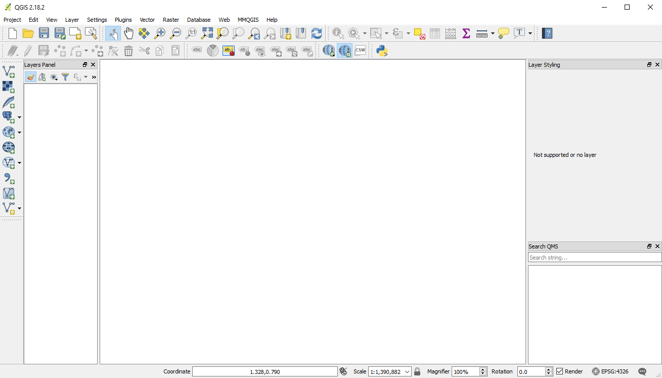
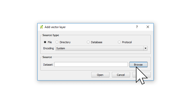
2. From the menu bar choose Layer → Add Layer → Add Vector Layer.
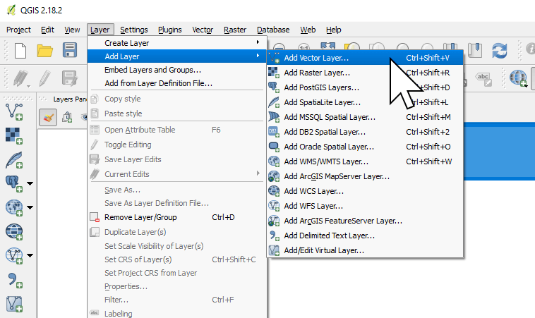
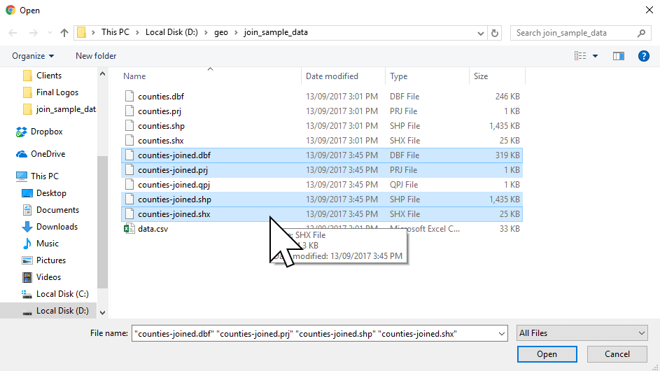
3. Navigate to the sample join data and select counties.shp.
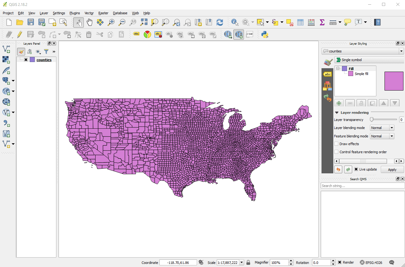
You will now see a map on screen showing all the counties of the contiguous US.
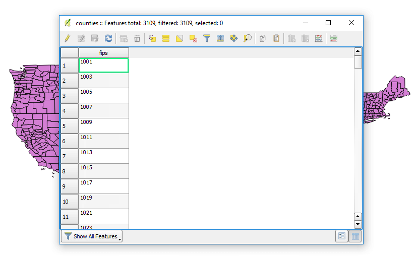
4. Right click on “counties” in the left hand layer panel and choose “Open Attribute Table”.
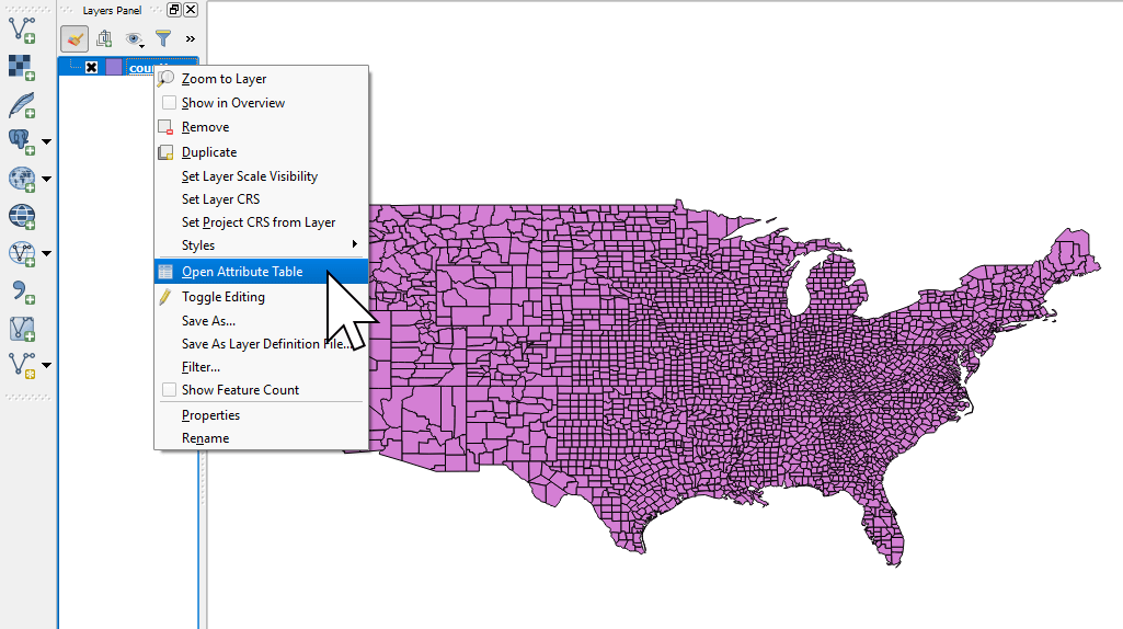
We will be able to see the information contained in the attribute table for the counties Shapefile. As you can see each county only has one piece of data and that’s the fips code - a unique county ID.
3. Loading the spreadsheet data in QGIS
Next we need to import our CSV.
1. From the menu, select Layer → Add Layer → Add Delimited Text Layer
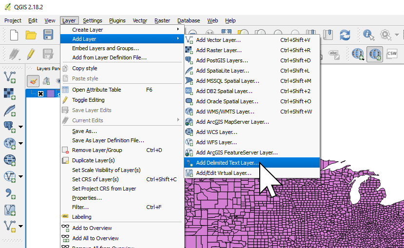
Click Browse and select the file data.csv from the downloaded sample data.
Set the Layer Name to Poverty Data, and set the File format to Custom delimiters and select Tab.
You should see a preview of the table with two columns: fips and pvrty.
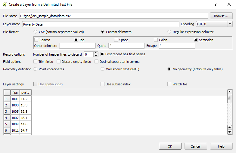
Finally, set the Geometry definition option to No Geometry then press OK.
4. Joining the Shapefile and the Spreadsheet
Now it’s time to “join” the datasets together.
Right click on “counties” in the Layers Panel on the left hand side and choose Properties.
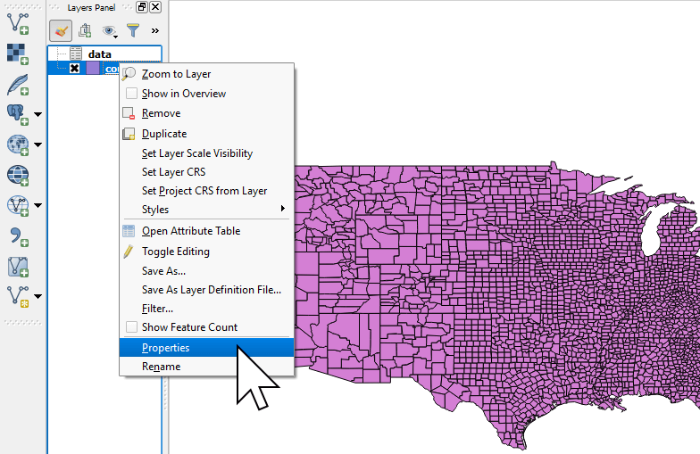
Go to the Joins tab and click the green plus icon at the bottom.
To join datasets, we need to use a property which is unique and present in both datasets, in this case it’s the “fips” code column in the Shapefile and the “fips” code column in the CSV.
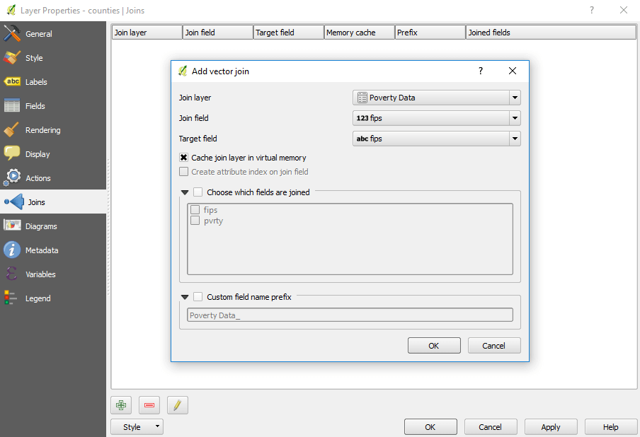
When we press OK, QGIS will match the records using the fips code and then add the additional columns from our CSV to the attribute table of the Shapefile.
Pro Tip: For this example, we’re joining the records using the fips code, but you could just as easily join records using any column that has unique values, such as state name or zip code. Trying to join on columns where the values aren’t all unique will cause data errors.
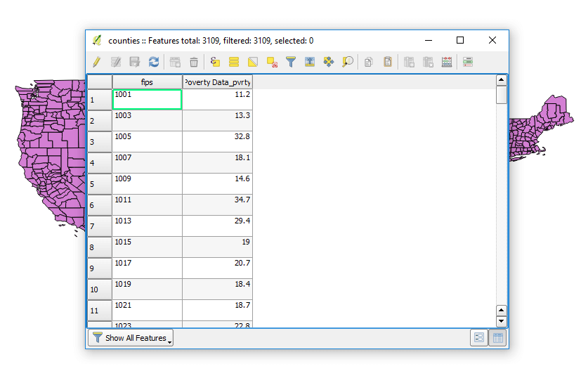
Once complete we can right click on counties in the left hand layer menu and select “View Attribute Table”, you will now see that a new column has been added called “data_pvrty” that contains the unemployment rate for each county.
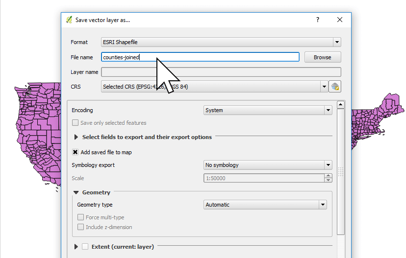
5. Exporting the joined dataset as a Shapefile
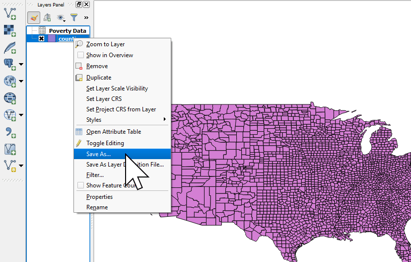
Close the attribute table and right click again on counties and select “Save As” to save the newly joined dataset. We now have a Shapefile that can be used in any mapping application to visualize the unemployment rate of counties.
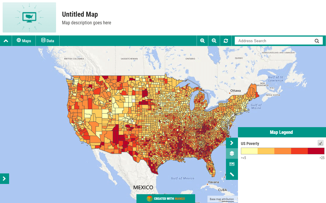
6. Creating our Heatmap
Now that you have your Shapefile let’s upload it to Mango and take a look. If you don’t yet have an account you can sign up for free here.
Once you have logged into your map portal complete the following steps:
1. Press the “CREATE NEW MAP” button the admin sidebar
2. Press “Add Layer → Upload Data”
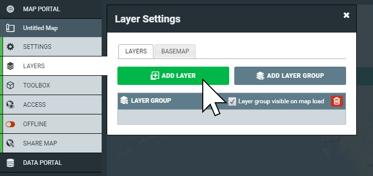
3. Select the four files of the Shapefile we made.
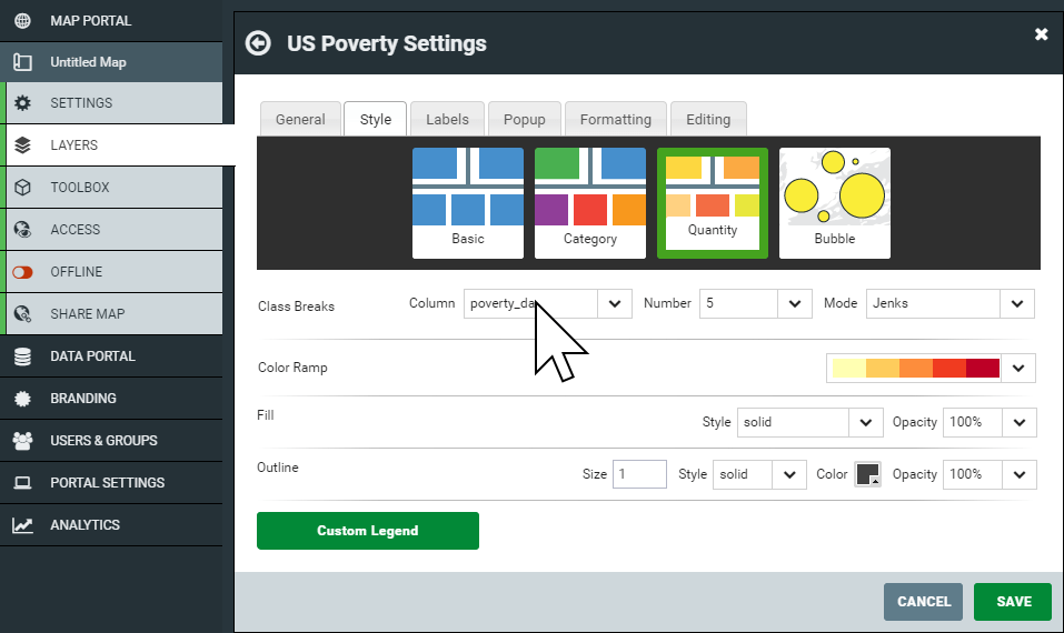
4. Once the upload finishes choose “Quantity” in the Layer Style panel.
5. In the Class Breaks row, select “data_pvrty” from the Column dropdown, and select “5” as the Number.
6. Press the green Custom Legend button at the bottom of the panel, and update the values in the Range column in the table to 5, 10, 15, 20 and 25. You'll see that the labels will update accordingly.
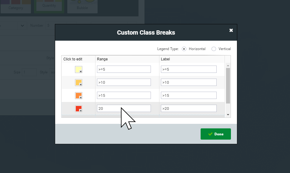
7. Press Done, then hit Save on the Style panel.
8. Admire your quantity map
You will now be able to see your heat map showing U.S counties by unemployment. The darker the red, the higher the unemployment rate is in that county. The graduated colors allow us to quickly identify clusters of unemployment throughout the country on a very granular level.
All done! Easier than you expected, right?
Click on a county, and you'll see a popup of the attributes for that county. Depending on the data you've joined, you could transform unemployment and population figures into dynamic charts using the attributes of each county, or add links, videos, or even images. You can even create a calculator tool that allows users to input a number and perform calculations based on attribute values for each county.
Adusting the visualization
Take some time to experiment with different values in the layer settings panel to see what happens to the map. Maps make it easy to draw conclusions based on bold visualizations, but you will find that minor changes to quantity settings will reveal vastly different visualizations.
Like music in a film can elevate underlying emotion or tension, cartographic design plays a large role in shaping the viewer’s understanding of a map. Turn the sound down on that blockbuster, and it probably doesn’t seem so dramatic.
So too, it’s important to remember that maps can quite easily lead to conclusions or assumptions that might not be accurate on close investigation of the underlying data, and can reveal the map maker’s bias towards a certain conclusion.
This is often desirable when creating focused story maps - after all, we usually create maps to tell a specific story, or lead viewers to a certain conclusion. Data truth is critical to your success, so extracting inaccurate conclusions won't help your business, so it's important to remain vigilant of inherent biases or trying to make a map that looks good, but fails to communicate the truth in the underlying data.
Now imagine other data you've got that could be overlayed on top of this unemployment map. Perhaps your store locations, your sales territories, or your customers. If you have addresses in a spreadsheet that you want to visualize on top of this map, head over to our tutorial on turning spreadsheet data into map ready coordinates.