The Internet has revolutionized GIS. GIS is no longer too expensive, too complicated or too isolated. It’s now easy to create engaging interactive web maps in minutes, and what’s more, they can be shared with anyone, anywhere, on any device.
We always knew GIS was powerful, we all knew we should be using it, and we all had a list of go to excuses to justify our reasons for not acting:
- We can’t afford GIS
- It’s just too complicated to get set up
- Our users can’t learn to use a GIS map
- It won’t work because our team is distributed
- We work in the field, not a GIS lab
One by one, web GIS has systematically destroyed all of the old objections to GIS adoption. Now you can literally set up and share an easy to use, mobile ready web map and distribute it throughout your organization in an afternoon.
What’s more, it will cost less than your office coffee bill!
The web has revolutionized every aspect of information distribution, be it news, video, the encyclopedia or how we communicate.
In GIS, the shift is even more dramatic, a web GIS is about so much more than functionality: it’s about the democratization of data.
Idea: Democratization of Data
Throughout ancient times purple was associated with royalty. The only way to produce this specific color was to extract it from a small mollusk found near the ancient Phoenician city of Tyre (situated in present-day Lebanon).
As many as 10,000 shellfish were required to obtain just a single gram of Tyrian purple. Due to its rarity and cost to produce, only affluent rulers from Egypt, Persia, and Rome could afford to wear it.
In the middle ages, Queen Elizabeth I of England decreed that only close relatives of her royal family could dress in this regal color.
In 1856, everything changed when an 18-year-old chemistry student, William Henry Perkin, stumbled across the first synthetic dye, mauve, while researching an anti-malaria drug for a professor. The young Englishman astutely patented the dye and spearheaded its mass production in the midst of the Industrial Age.
Suddenly, common people could afford to dress in a color that was previously reserved for only the rich and powerful. Not surprisingly Perkin became wealthy, retired at 36 to focus on research, and was subsequently knighted for his scientific contributions.
Data is the New Purple
If you think desktop GIS is powerful, you haven’t seen anything yet. Web GIS isn’t about outperforming desktop GIS or even competing with it. It’s about making the power of GIS available to everyone.
While watching a proficient GIS user visualizing map data in their desktop GIS system is pretty cool, seeing Susan in sales — without any prior training and using only her web browser — locate every household within her territory that isn’t a client, in a zip code with an average household income above $250k, with a median age between 35 and 45, is nothing short of mind blowing!
Your job when building web GIS systems is to create something that’s so focused and so refined that it’s self explanatory. The user doesn’t need training, they don’t need to be incentivized to use it. The power and benefits are so obvious they will be wondering how they ever worked without it.
In this chapter we are going to show you the ingredients that make up a great web GIS system.
The Scalpel vs the Swiss Army Knife
Early web maps tried their hardest to replicate the look, feel and functionality—read complexity—of desktop GIS systems. It reminds me of the famous Henry Ford quote:
“If I had asked people what they wanted, they would have said faster horses.”
It took time before the GIS industry began to realise that what we needed wasn’t more, it was in fact less.
What’s funny is that this shift didn’t come from the deeply entrenched GIS industry, instead it came from Google when they released Google Maps. Although Google Maps isn’t a GIS in the traditional sense of the word, it is extremely simple and very easy to use.
When Google Maps burst onto the scene with a product that was so easy to use, that within weeks everyone from preschoolers to grandparents were navigating the world using nothing but a web browser, the entire GIS industry did a collective face palm and said “Of course…”.
Since then, web GIS has had something of a renaissance. Everyone now realizes that the true power of web GIS is simplicity and availability.
So instead of web GIS systems that try to do everything, the now accepted best practice is to build “story maps”.
A story map is a map that’s laser-focused on answering one particular data related question or workflow. But our users have lots of questions, I hear you say. Then build lots of maps!
Story Maps
If you are taking the time to produce a web map it means that you have data that is worth sharing and therefore contains a visual message that will be of use to others.
We use the term ‘story map’ to describe a map that is extremely focused and exists to tell the story of the data in the clearest way possible.
A truly great web map will leave the user with absolutely no doubt about the story that’s being told through the data and they will leave feeling that they have learned something new through their interaction with the map.
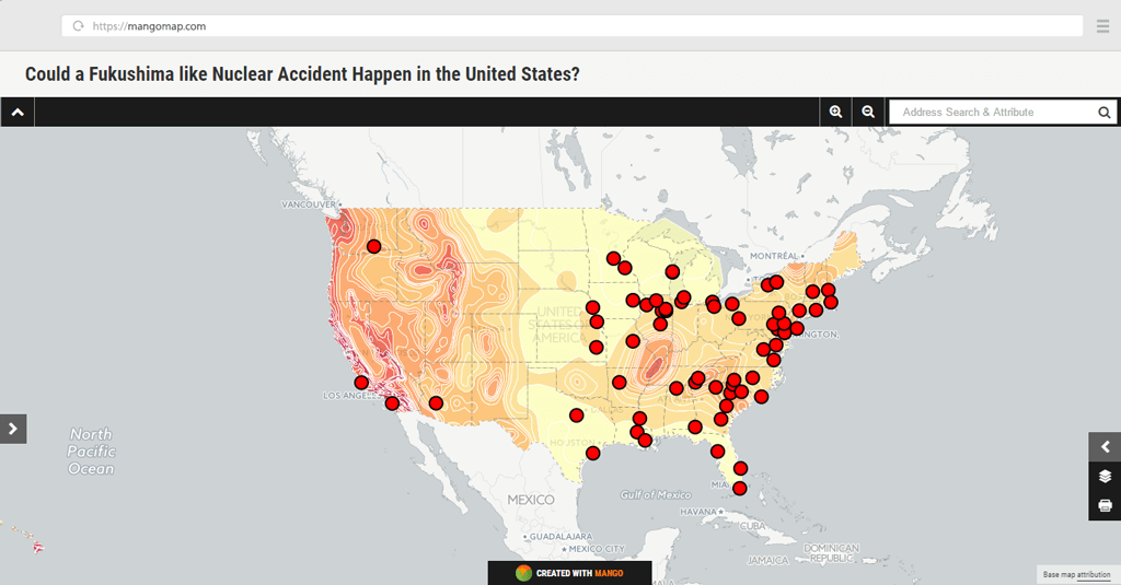
The map above is a great example of a focused high impact map with a clear message.
As soon as the map is loaded the user is greeted with the question in large font at the top of the page “Could a Fukushima like Nuclear Accident Happen in the United States?”, immediately they know what they are looking for in the map data that is presented before them.
The map itself uses rich colors for maximum visual impact and large red markers for the nuclear facilities.
For those of us used to stylising maps on the desktop with subdued pastel colors and cross hatch fills it can take a little getting used to these high impact color schemes but we need to remember that when making web maps it’s not only the medium that’s changed, it’s also the audience.
The internet is the land of constant distractions and miniscule attention spans, your map has to compete with those distractions and engage the user from first second the page loads.
When we look at the legend we can see that it’s extremely simple with only two layers, nuclear facilities and seismic hazard data.
We could have easily of added a point layer showing the location of each individual earthquake but would it have added to the story or just acted as an unnecessary distraction from the maps core story? When it comes to story maps, less is definitely more.
Will Web GIS Replace Desktop GIS?
The short answer is no — at least not anytime soon. The two technologies are complementary and have a symbiotic relationship. Desktop GIS is to web GIS what a word processor is to a blog.
A desktop GIS is fantastic at creating and manipulating GIS data, but useless when it comes to distribution and accessibility.
A popular workflow is to use a desktop GIS for the data preparation and heavy lifting. Then once the data is ready using the data to create a web GIS application in order to put the maps and data into that hands of those who need it.