A GIS has one purpose: To allow you to quickly and easily answer questions about your data that relate to location.
The most common use of a GIS is is to produce data visualizations in the form of a map. The idea being that each visualization is communicating something that might not be obvious from the raw data alone.
Let’s go ahead and look at some common examples.
Map Types
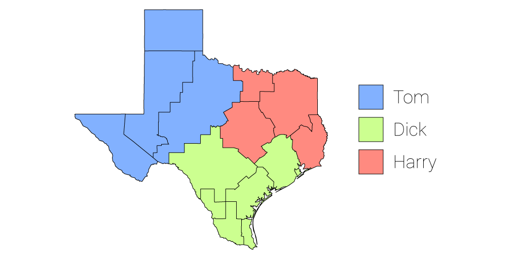
The Category Map
The most common type of GIS map, and in many way the most simple is the category map.
A category map allows us to visualise which category each location belongs to. The example below shows sales territories, categorized by dealer. By looking at the legend we can quickly see which sales territories belong to which dealer.
Let’s Take A Look Under the Hood
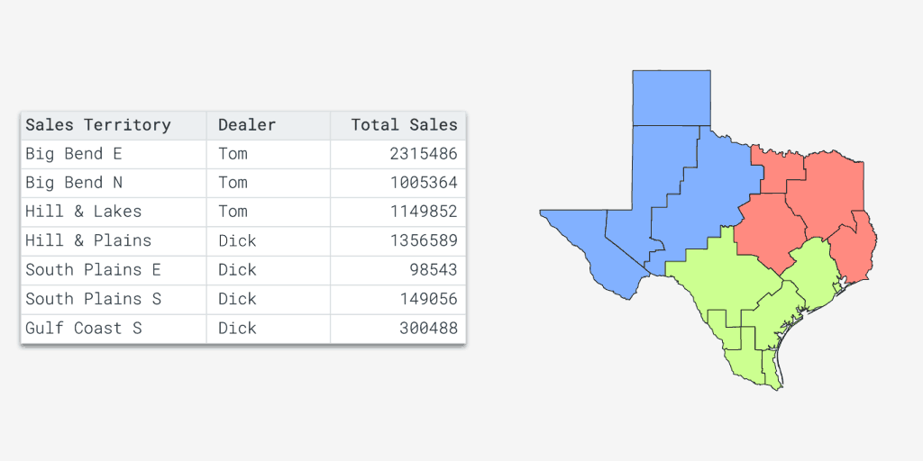
A common misconception for those new to GIS, is that maps — like the category map above — are created in the same way that a graphic designer might create an illustration; i.e., starting with the outlines and then clicking on each area to change the color based on which dealer it belongs to.
To an extent that is what’s happening, except the GIS is doing the work rather than you. You see a GIS is data driven, and we use rules to dictate the color or appearance of each “feature” on the map.
The rules — or “styles” as we call them in GIS speak — are based on data. For example our data looks like this:
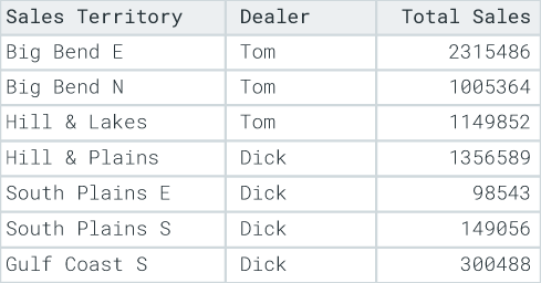
Each row in the table represents a feature on the map. So we can tell our GIS that we want all sales territories that belong to Tom to be colored red and our GIS will dutifully oblige.
In future if Tom gains more sales territories, we don’t need to touch the map. We just change the dealer value of a territory to Tom’s name and the map will magically update itself.
The Quantity Map
Each feature in the map below is color coded based on sales. The darker color indicates more sales and lighter colors represent fewer sales.
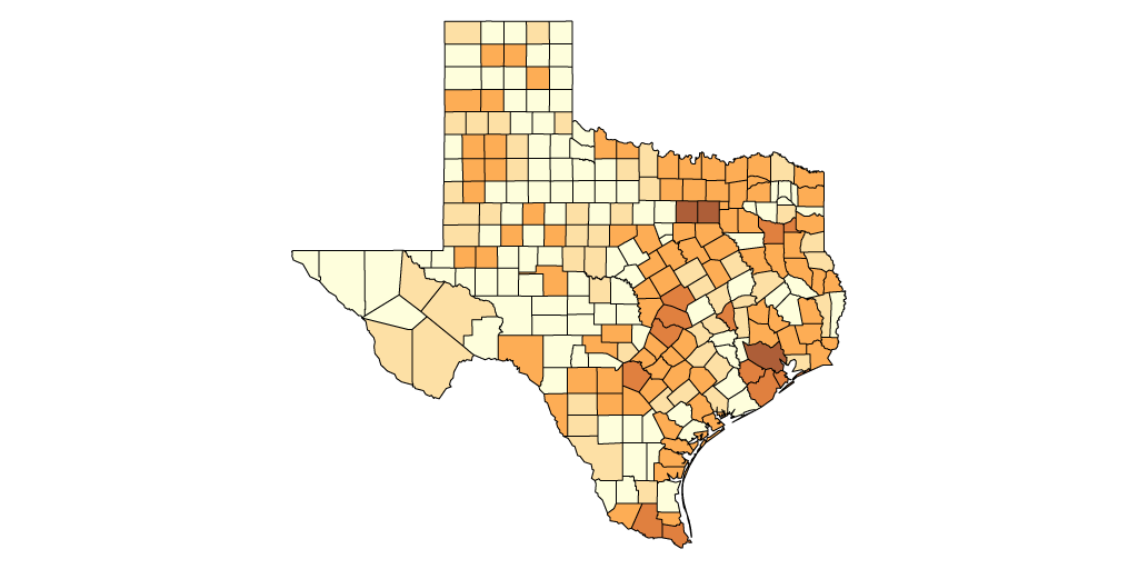
This type of map is generally called a quantity map and if you are feeling particularly nerdy you can also call it a choropleth map. Sometimes this type of map will be referred to as a heat map, but this is incorrect terminology and shortly we will be looking at what a heat map actually is in GIS.
This type of visualization is useful for identifying patterns and trends based on location and is most often used for business analysis and demographics mapping.
Just like the category map above, this map is data driven and uses rules based on a number “attribute” in order to style each feature.
Creating the rules for quantities is a little more complex than it is for categories. Our legend will show a color ramp with each color on the ramp representing a number range.
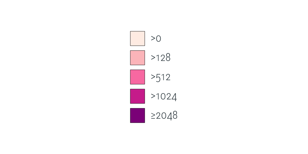
Each color on this color ramp is commonly referred to as a class break. To define our class breaks we will need to tell the GIS two things; the first is how many class breaks we want and the second is is the number range for each class break.
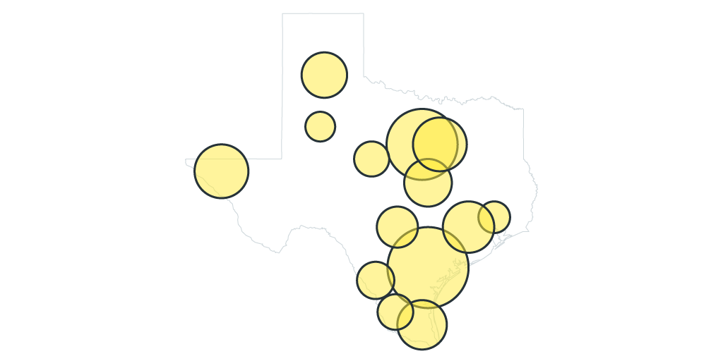
Bubble Map
Also known as a “graduated marker map”, a bubble map works in exactly the same way as a quantity map. But uses a range of bubble sizes rather than colors to visualize the variance.
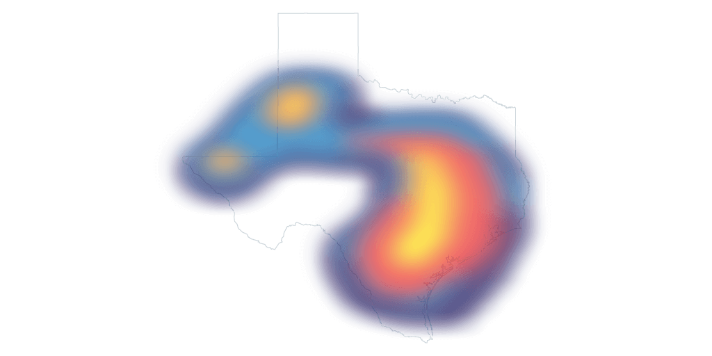
Heat Map
A heat map is used in instances where our location data is so dense and tightly packed that we can’t make visual sense of it. Heat maps are ordinarily used when mapping “points”.
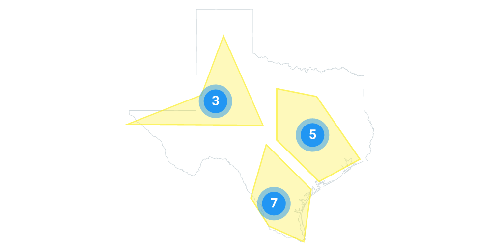
Cluster Map
A cluster map solves the same problem as the heat map. It’s a way to make sense of point layers that have a large number of features, but instead cluster nearby points together into a single point.
This cluster point usually uses a combination of color, size and labelling to communicate how many separate points each cluster encompouses.
Stacking Layers
A GIS map is often made up of multiple layers. The map types that we looked at above can be stacked on top of each other into a single map, each map in that stack is referred to as a “layer”.
In most GIS systems each layer can be turned on and off in the map legend or moved up and down in the stack.
For example, in one map you might have one layer that contains the boundaries of each dealers territory, another layer that shows sales volume by county and another point layer showing the location of each dealers premises. The end user can then toggle each layer on and off as required.
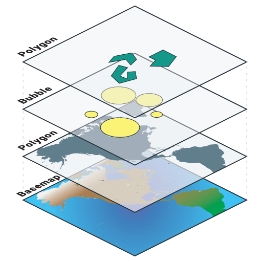
In web GIS systems it is also common to use what is known as a base map. A base map is a map similar to the street maps and satellite maps that you are used to seeing on Google Maps. Base maps give your map layers additional context and act as supplemental data.
Map Interactivity
The layers on the map are only one half of the story. What separates a GIS map from a printed map is interactivity. The basic controls of most GIS systems work in the same way as Google Maps, which I’m sure you are already familiar with.
The map can be panned and zoomed to find an area of interest and then we can click on items on the map to find out additional information, in GIS this is called an “identify”.
Map Tools
Map visualizations are just part of the story. What really separates a GIS system from a printed map is user interactivity.
As I said earlier, GIS is a very broad subject and there are some very niche GIS systems and tools, but let’s take a look at some of the tools that are common to most GIS systems, both on the desktop and the web.
Map Query Tools
A GIS query tool, or selection tool as it is often know, allows us to filter a dataset based on criteria that we define. For example we could say “show me all of the counties in which we made more than $50,000 in sales last year”, the GIS system would then highlight those features on the map.
Query tools allow maps users to do more than what the map maker envisioned when they styled the layers.
When making the map we will try and guess what data and visualizations the end user will find interesting and make sure we include layers that highlight those data points.
A query tool future-proofs our applications by allowing our users to build their own queries that we may not have envisaged when we first created the map.
In desktop GIS systems the query tools are usually very powerful and capable of building large and complex queries, the downside is that they also have a steep learning curve.
Web based GIS systems tend to have query tools that are more limited but much more intuitive, making them suitable for sharing with users that have no GIS experience.
This distinction is true across most features that are available on desktop and web GIS systems.
A desktop GIS is great for a power user that has time to invest in GIS learning activities, such as reading this book.
A web GIS system however, is a much better choice if you want to share your maps with a larger, more distributed audience. An audience which likely doesn’t have access to a desktop GIS system, nevermind the time required in order to learn how one functions.
Printing Maps
Printing maps is still a common task in GIS, especially on desktop systems.
It’s still common for companies to have a GIS department that’s responsible for creating maps and maintaining the GIS system. When non-GIS users require a map they will ask the GIS team to create a print or a PDF.
Slowly the internet is changing this workflow. It’s now becoming increasingly common for organizations to make their maps available to staff and clients via a user friendly web GIS.
This is preferred, as good web GIS systems don’t require any training or specific tools beyond a web browser.
Search
Maps can be searched by address or by values in the attributes of their layers.
Search is an area web the web tools tend to outperform desktop GIS systems. The web systems offer Google style fuzzy search that can search across multiple layers and list the results based on the quality of the match.
Search on desktop GIS systems still tends to be much more clunky and involve first choosing the layer and column within the layer that you wish to search.
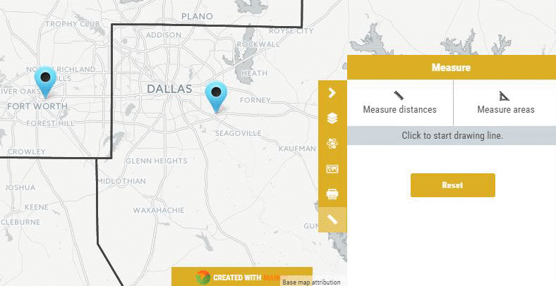
Measuring and Distance Tools
With any map it’s important to get a sense of perspective. Scale bars on a map let us know what distance those on screen pixels represent in the real world, and measuring tools allow us to accurately measure paths or areas on screen.
Is that it?
Nope, the tools listed here are just the tip of the iceberg, and will only give you a taste of what’s possible. Most GIS systems include a much larger range of tools.
And niche products will contain tools that are geared towards doing complex calculations based on geometry and the spatial relationship between features. We will be covering these features in more depth later in the book.
The Anatomy of a GIS Map
Every GIS program is different but they do tend to share some common DNA. Most GIS systems will have the following things in common:
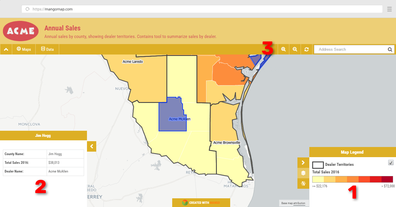
(1) Legend
The legend is where we make sense of what we are seeing on the map. The legend will list all of the layers and also show us the symbols and class breaks used in the styling of each layer.
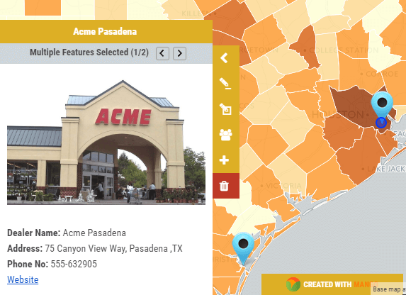
(2) Info Window
Sometimes it is displayed as a popup, other times it’s show in a sidebar. The info window is used to display supplemental information, for example when you click on a map to identify a feature, the attribute data for the selected feature will be displayed here.
(3) Toolbar
The toolbar will be displayed on the top or the sides of the interface. In desktop GIS systems these toolbars will be large and comprehensive, in web based systems they tend to be smaller and much more focussed.
Now we understand what a GIS is and what is can do, the next step is to understand how a GIS is made.