The legend of a map is the most important feature after the map itself. The legend conveys the meaning of the map’s symbology, and without it the user of the map will be lost.
In this article we will be looking at the most common symbology used in web maps and also being looking at best practices for building your map legend.
So let’s begin by looking at the symbology, layers and ordering used in web maps and how they often differ from standard GIS or print maps.
Web Map Layers and Ordering
A map is usually made up of more than one layer. Even the simplest maps that are looking at a single dataset might contain multiple layers, these additional layers are used to give content to the main dataset.
For example, if we are mapping counties by population. We might choose to also include the state boundaries to give the user geographic context, we might also add the major cities as points to help users visualize why particular counties are so populace.
We might also include a base map with satellite imagery or a street map in order to give the user a detailed context.
In particular, the use of base maps is far more common in web maps than in desktop GIS systems. This is partly a legacy of Google Maps setting the tone for user expectations when it comes to web maps and is also less common in a desktop GIS system as the preferred workflow to locate areas of interest is using a query, rather than visual cues.
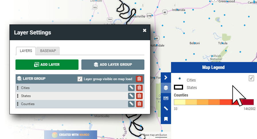
So the legend for this map might look like this:
- Cities marked as points with a label containing their name
- States outline with a thick stroke and a transparent fill
- Counties with a thin stroke and a graduated color fill based on population
- A Bing streets basemap
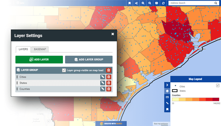
In a GIS system we would be able to toggle each layer on and off in the legend. For web mapping this is often not the case due to performance constraints.
With a desktop GIS our data is stored locally and our GIS system can quickly get the geometry from the hard drive and render it on screen.
With a web map all the data needs to travel across the internet in order to render on the user’s screen. That’s fine if the dataset is small, say under 100KB, but sending the raw data isn’t feasible when the size of the dataset is measured in megabytes or even gigabytes.
To get around this problem web mapping system use image tiles, these are a mosaic of square tiles that render the map onscreen.
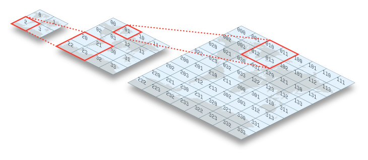
This approach is used because it’s much quicker for the map client in the browser to tell the server what it wants to view, and then have the server render tile images from the raw data and send that, than it is to send the raw data.
The data transfer for enough tiles to fill a screen is only one or two megabytes, regardless of whether the raw data on the server is 10MB in size or 1000MB, or the image tiles show the data for a single dataset or one hundred datasets stacked on top of each other.
This approach offers great benefits in speed and performance, but does present some limitations. The main one being the performance impact of being able to turn layers on and off in the legend, if multiple layers are contained in a single tile set (image), then the layers can’t be turned on and off in the legend
So take our example above. We could send all four layers in a single tile set, which means they are all merged together in a single image, to fill a whole screen with tiles will only use 1 to 2 MB of data transfer.
If we wanted the layers to be turned on and off in the legend, then we would need to have one tileset for each layer and stack them on top of each other on the map.
I’m sure you can already see the problem here. Now to fill a screen with tiles for all four layers we will need to transfer 4 to 8 MB of data transfer rather than 1 or 2 MB. With each tile set in the stack the amount of transfer grows and the performance overhead increases.
This means that you should carefully consider which layers you need to give the end user the ability to toggle on and off in the maps legend, as there is a performance cost for each one.
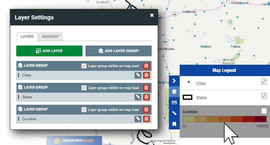
Breaking layers into separate layer groups means more control, but comes at a cost of more map tiles to download.
Web Map Symbology
The styles and symbology used in web maps is usually similar to those found in a desktop GIS, although current trends to tend to prefer bolder colors, strokes and designs in the web map context.
Also as discussed above, due to performance and simplicity it’s usually preferred to have fewer layers and a simpler legend for a web map.
Let’s take a look at the common symbology types used in web mapping.
Basic Symbology
Basic symbology displays the color, stroke and fill for all features within a layer regardless of their attribute values.
This type of symbology is usually used for supplemental data in a GIS, such as boundaries and outlines.
Category Web Maps
Category maps give each feature a different color or style based on the underlying attribute data. For example, a zoning map, will use a different color for each zone type allowing the user to quickly and easily identify zones of interest.
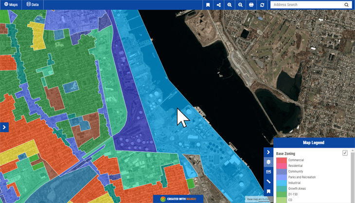
The system will map each possible value in the attribute data with a specific style. E.g.
- When "Zone Type" = "Industrial" then the fill color will be blue.
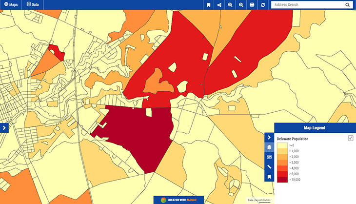
Quantity Web Maps
Also knowm as choropleth maps, these maps are similar to category maps as in they use different symbology for each feature in a dataset based on value. But the difference is that each color represents a number range. For example, visualizing counties by population. E.g.
- When "Population" is greater than 10,000 and less than 19,999 then the fill color will be dark red.
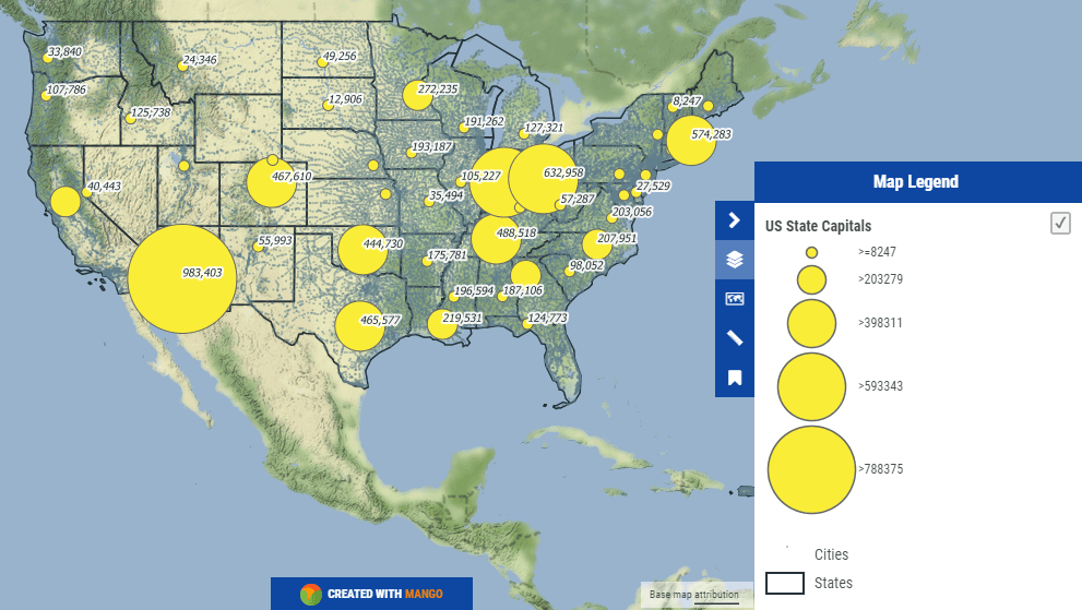
Bubble Web Maps
A bubble map works in the same way as a quantity map, as in each symbol represents a number range, but the difference is how it’s visualized. A bubble map as the name suggested used circles with the size of the circle representing the range the value falls into rather than color.
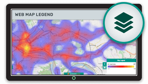
Heat Web Maps
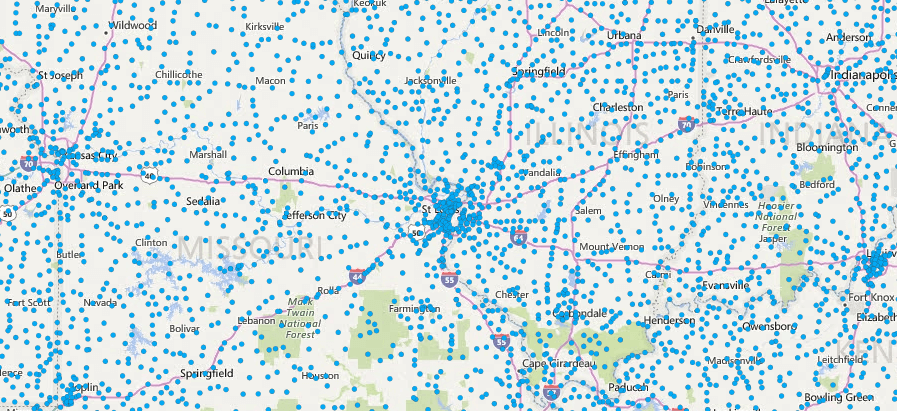
A heat map is used to see patterns in large point datasets. For example, vehicle accidents in a major city over a ten-year period. If we just add each accident to the map as a point it will likely completely color in the map and make it difficult to identify patterns in the data.
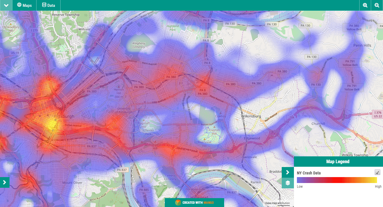
A heat map will display a yellow color for areas with the highest concentrations and fade out to dark blue for areas with the least.
Clustered Pushpin Web Maps
Another strategy to get around the problem of high density point layers is clustered pushpins. With the visualization and markers that touch in the current map view are joined together into a cluster with a number placed on top of the cluster marker to say how many points it represents.
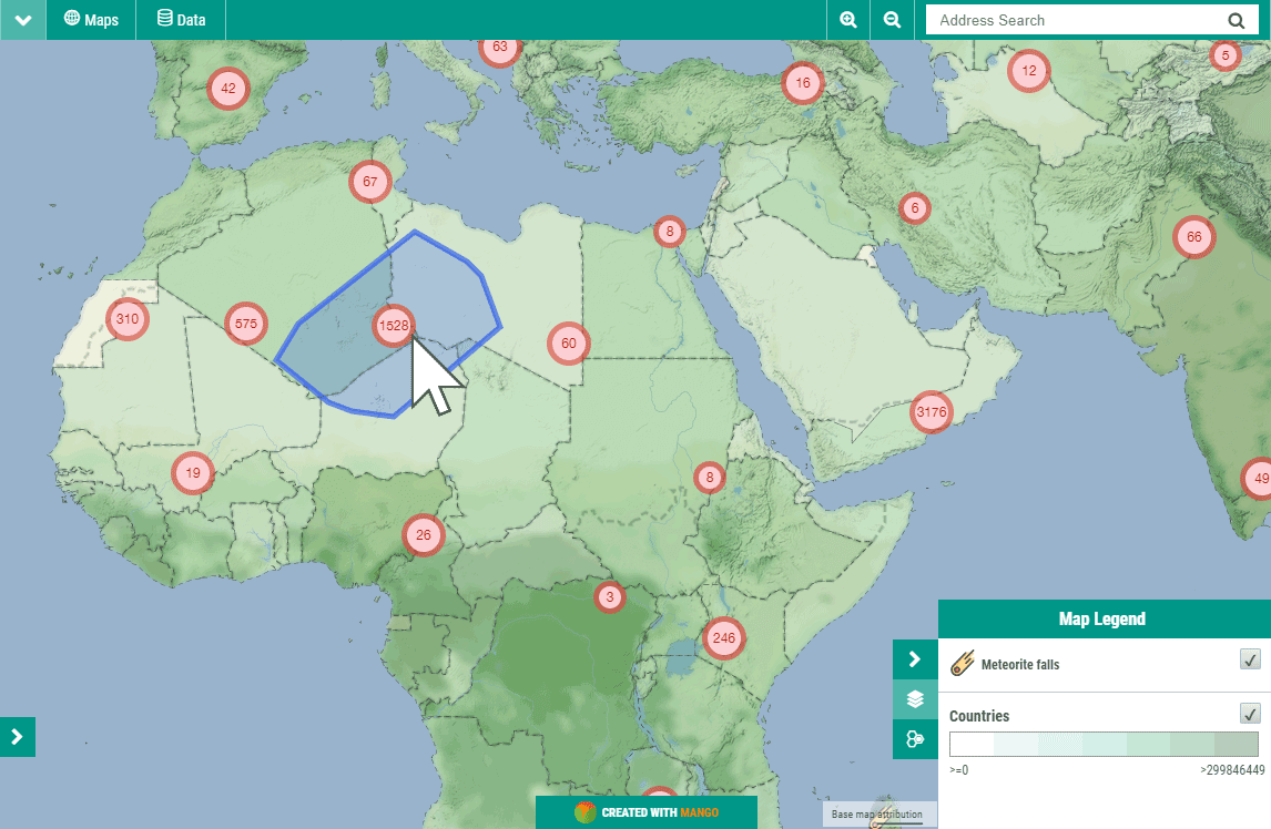
The cluster markers also use color and size to further highlight areas with large concentrations. When the cluster maker is clicked it will "explode" which mean each marker in the cluster will be placed in their correct location and the map will zoom in to a level at which all those markers are best displayed.
Configuring Your Legend and Symbology Using Mango
Setting up your legend in Mango is very simple. All you need is a Mango account and a web browser, then everything can be setup with just a few click.
As with all Mango features what you won’t needs is:
- Any programming skills
- A server
- Expensive software licenses
Please take a moment to watch this short video (1:18) that outlines the benefits of Mango’s legend and symbology options: