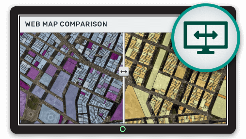
A powerful map visualization is the ability to compare two layers side-by-side. Often patterns that would be impossible to spot in the raw data are obvious when viewed in this way.
Some common examples of comparison maps are comparing the same data at two different points in time or comparing two related datasets.
For example, we might want to compare sales volume by zip code for this year and last year. Or we might want to visualize the correlation between average household income and average property value for a region.
There are a few common ways to achieve this comparison on a web map and in this article we will take a look at the most common options.
Side by Side Map
A side by side map as you have probably guessed places two layers side by side. This is often enhanced by providing a vertical slide bar that the user can drag from left to right to hide and reveal the layer below.
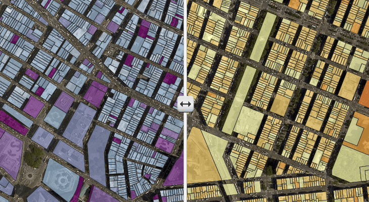
This method works best when we are comparing only two layers.
Layer Stacking
This method stacks each of the layers of interest on top of one another and gives the user the ability to turn each layer on and off in the legend. The user can then make the visual comparison by toggling the top layer on and off to reveal the layer below.
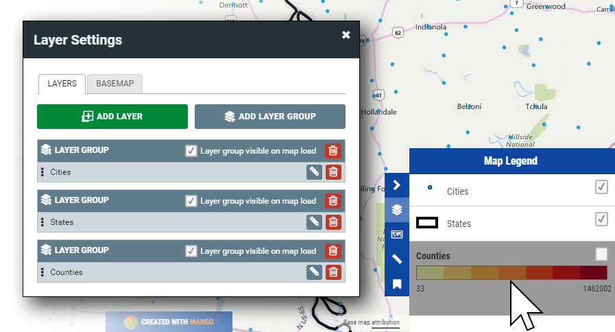
This approach offers the benefit of being able to offer more than two layers to compare.
Cross Hatch Fills
A throwback to paper mapping, a cross hatch fill places lines across a feature allowing us to still see the symbology of the layer below. So for example we could have a quantity layer on the bottom that shows zip codes by sales volume, then we could have another layer above that applies a cross hatch fill to each of the zip codes where the annual sales quota was exceeded.
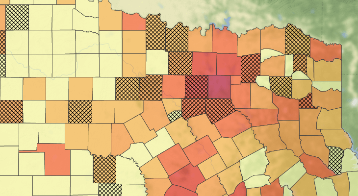
Cross hatch fills work great when things are simple, but using a large number of these types of fill on a single layer can make the make difficult to read and patterns difficult to identify.
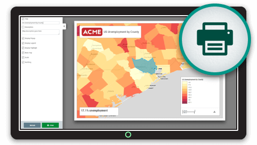
Creating Comparison Maps with Mango
Mango, our simple to use online GIS, makes it easy to create comparison maps using all the methods outlined above. All you need to get started is a Mango account, a web browser and your data, then everything can be setup with just a few clicks.
As with all Mango features what you won’t needs is:
- Any programming skills
- A server
- Expensive software licenses