The land record map by far the most heavily accessed map in a city or county web map portal and in this article I’m going to be showing the elements that make up a superb interactive land record map.
Through my work at Mango I’ve created dozens of land parcel maps and viewed countless more from counties and cities across the country using our web GIS. Some get it right, but many don’t. Following the steps in this video will allow you to be one of the ones that get it right.
You might have been making maps for years, but often these maps were either for your own use or only shared with a small knowledgeable group within your organization. I know that the thought of opening up our work to the entire internet can be a little daunting to say the least. But fear not, if you follow the simple steps in this tutorial you will have a land records map that residents, assessors and appraisers will love.
The first step in getting it right is a shift in perspective. One of the biggest mistakes in design is to assume that everyone else sees the world in the same way we do, but if we take a step back and look at the application from the point of view of our users it’s easy to make design decisions that work.
Really we only need to know two things about our users. Who are they? And, what do they want to do? It’s our job to take them from point A to point B in the smoothest way possible.
So let’s jump straight in and look the core elements of any land record map.
Make Your Parcel Layer Stand Out
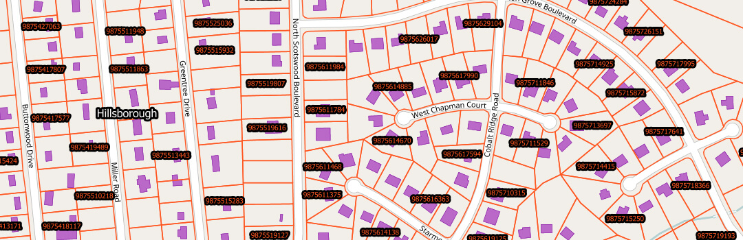
Of course the most important element of any land parcel map will be the land parcel layer so we will start with that.
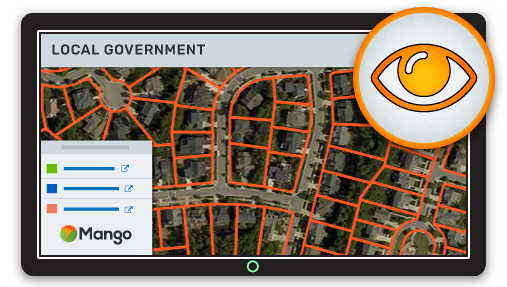
An orange outline with no fill has become the defacto standard for parcel boundaries which as of course the most important layer on a land records map.
On a desktop GIS we often aren’t using a base map, so any dark color will offer good contrast, but your web map users will demand a base map below your data in order to give them context.
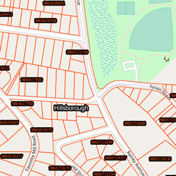
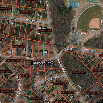
The base maps will either be a street map or a satellite map and this makes an orange outline ideal because it gives good definition for both. Especially the imagery which for most places outside of Nevada and Arizona will be predominately green.
Give the User Context
We would all love our map users to use our carefully crafted search tools, but the reality is that most users will just drag and zoom their way to their area of interest. This means we need to give them as much context as possible.
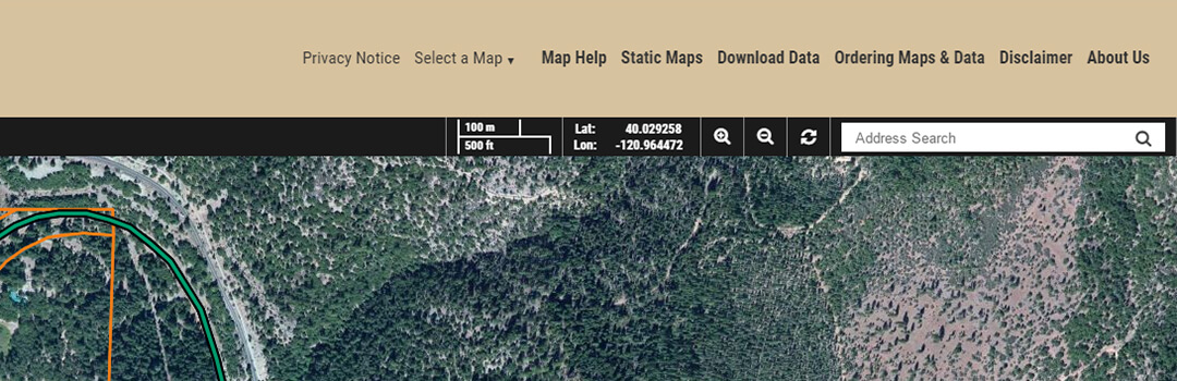
Base Map
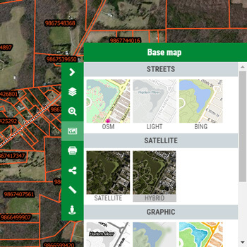 The first consideration is a base map layer. A hybrid view that has the road and neighborhood names above satellite imagery is a good default choice, but it’s also important to allow users to switch the base map so more advanced users can choose the basemap that’s best suited to their specific requirements.
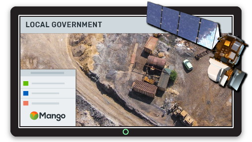
Aerial Photography
If you have access to recent aerial imagery you should also consider using this as the base imagery provided by companies such as Bing may not be as up to date and will offer lower levels of detail. These should either be uploaded to your web mapping system or better yet added as a WMS map service in order to avoid having to do large uploads.
Google Street View
Another nice feature for adding context is integration with Google Street View. This allows users to click on a place on the map and then explore as if they were walking along the street rather than looking at it from above. This is especially beneficial for appraisers looking to gain a greater understanding of the area.
Information Sidebar
From experience you will have a feel for the technical ability of your user base; if the technical ability is generally low then it can be a good idea to include a side panel on the map with instructions explaining how the system is intended to be used.
Alternatively you could also include a help link in the title bar that opens a popup with instructions.
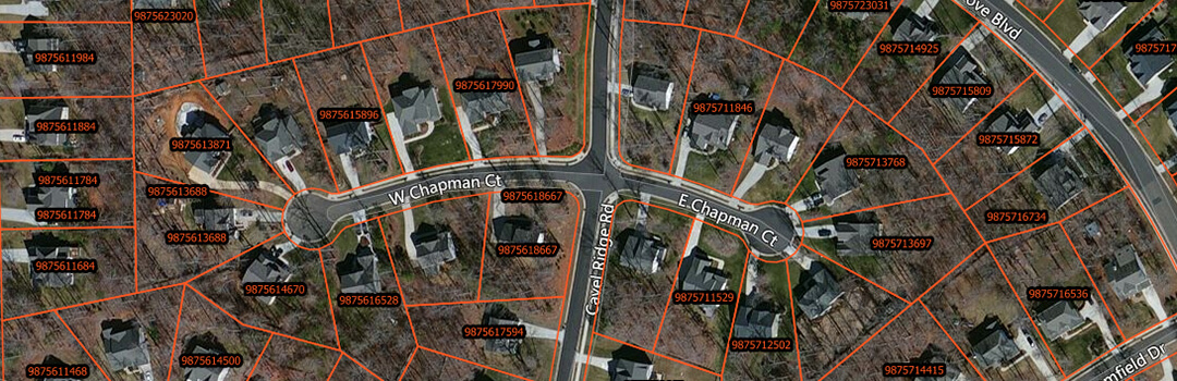
Parcel Labels
Lastly, add labels to your parcel layer. Preferably this will be the APN (Assessor’s Parcel Number) as this will make it easy for users to find multiple closely located parcels from a list.
Make the Popup Windows Really Pop
A common mistake on land parcels maps is to pay little attention to the popup that’s displayed when a parcel is clicked. We see too many maps that is just a dump of all the attribute values for that parcel in no particular order and containing some attributes that are of no use to the end user.
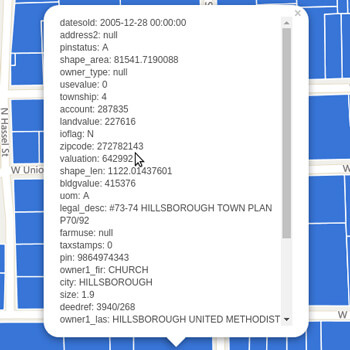
A good practice is to make the title of the popup window either the APN or the property address.
The body of the popup should then contain only the information that the end user needs to see, formated in an easy to read manner. If your data contains links or images these should be displayed as such. For example a photo of the property.
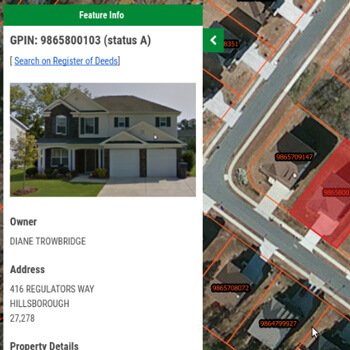
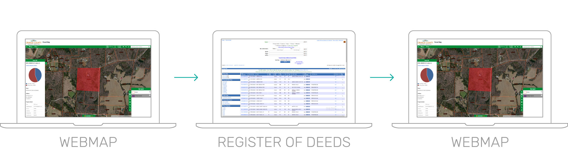
A very important feature is a link from the parcel popup to any other web based systems that contain information for the parcel such as the register of deeds, property cards or tax statements.
A best practice is to also have a link from these external information systems back to the parcel on the map, this means the user can navigate seamlessly from one to the other and back again.
Popups can also benefit from videos and charts providing your data contains suitable information for these.
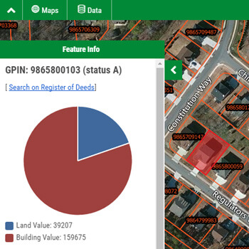
Charts using attribute values add a secondary layer of insight.
Provide Tools to Simplify Workflows
Your parcel map will be used by a wide range of people. Some will be residents looking for information but others such as appraisers will be power users that are interacting with the system on a daily basis.
It’s important to strike a balance in which the system is simple to use for new users such as residents but also efficient to use for power users such as appraisers.
So rather than just adding every tool we can we should think about how the map is commonly used and how to streamline that process.
The most common workflow will be to search for an address or APN, view the parcel information in the popup and then do a print.
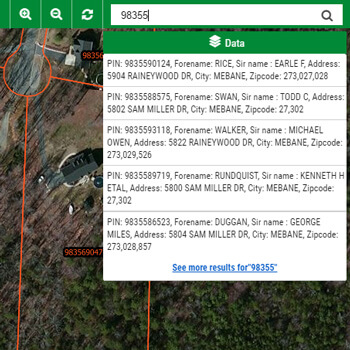
To simplify this process we should have a single Google style search box that allows search using a partial piece of text, either the address or APN number.
What we want to avoid is a GIS style search system with a form where users enter values into fields, as this type of search is unnatural to most web users and they also tend to be quite unforgiving in terms of the matches returned.
Once the user click on the result they should be taken to the parcel on the map, have the parcel highlighted and the popup window with the parcel data displayed. The user can then choose to either make notes of the information, print the map or follow the links to external system such as the register of deeds, property cards or tax information.
Provide Supplemental Layers
You parcel map should provide supplemental layers that add something to the workflows rather than distract from them.
For example layers such as roads which are already contained in the base map or parcel centroids which don’t provide any additional information should be avoided, whilst layers such as building footprints or recent aerial imagery will add to the experience and complement the parcel data.
Integrate Your Parcel Map with your Brand, Map Portal & Website
You might not think that as a branch of government that you have a brand, but you do. A brand isn’t just about advertising, it’s about trust and authority.
When your users are viewing the map how to they know it’s authoritative? How do they know the information is from a trusted source? Remember that the vast majority of the users of your map will have entered the map from Google rather than link on your City or County website.
Add Your Logo
A logo lets users know who published the map.
![]()
Match the Color Scheme with Your Website
Branding is about consistency; your users should feel a consistency when navigating between your website and your maps. Therefore it’s important to have a consistent color scheme across both your website and your map pages so the users feel they’ve entered another section of your site rather than left your site a entered another one.
Navigation Between Your Map and Website
Navigation should be two way, your users should be able to navigate from your main website to the map and from the map back to your website. This kind of cross linking builds trust and provides users with a seamless experience.
Users should also be able to navigate easily between your other published maps.
Use Your Own Domain Name
The gold standard for trust is to use your own domain name. Anyone can create a map and put your logo and color scheme in place but by seeing your domain name your users are certain of the source.
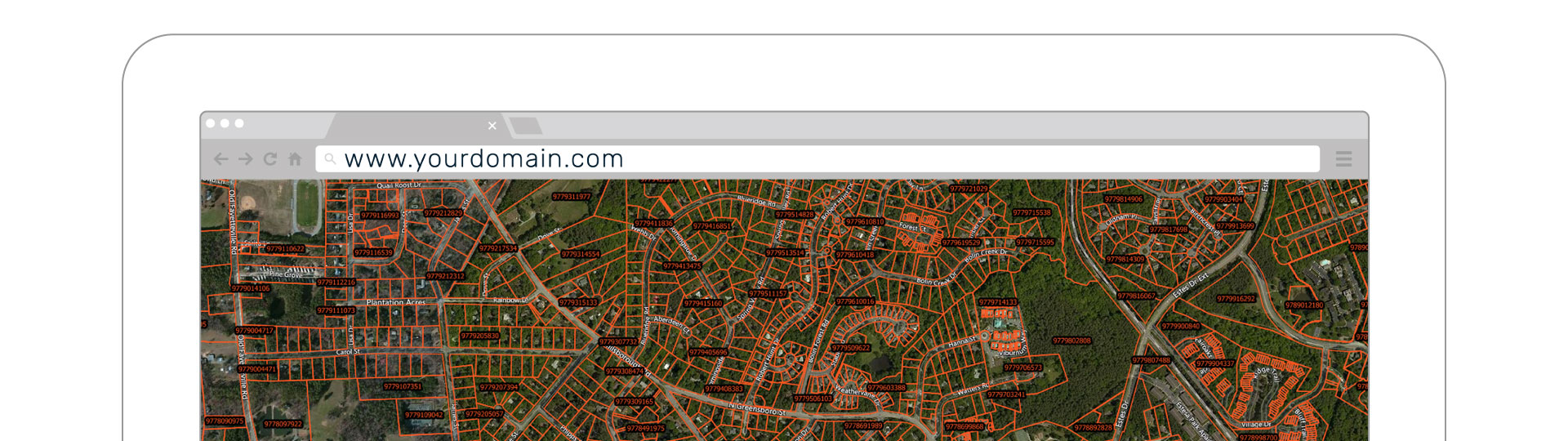
Too many Cities and Counties using cloud based mapping systems continue to use the domain name of the cloud map provider rather than their own which causes many users to question the authority of the source.
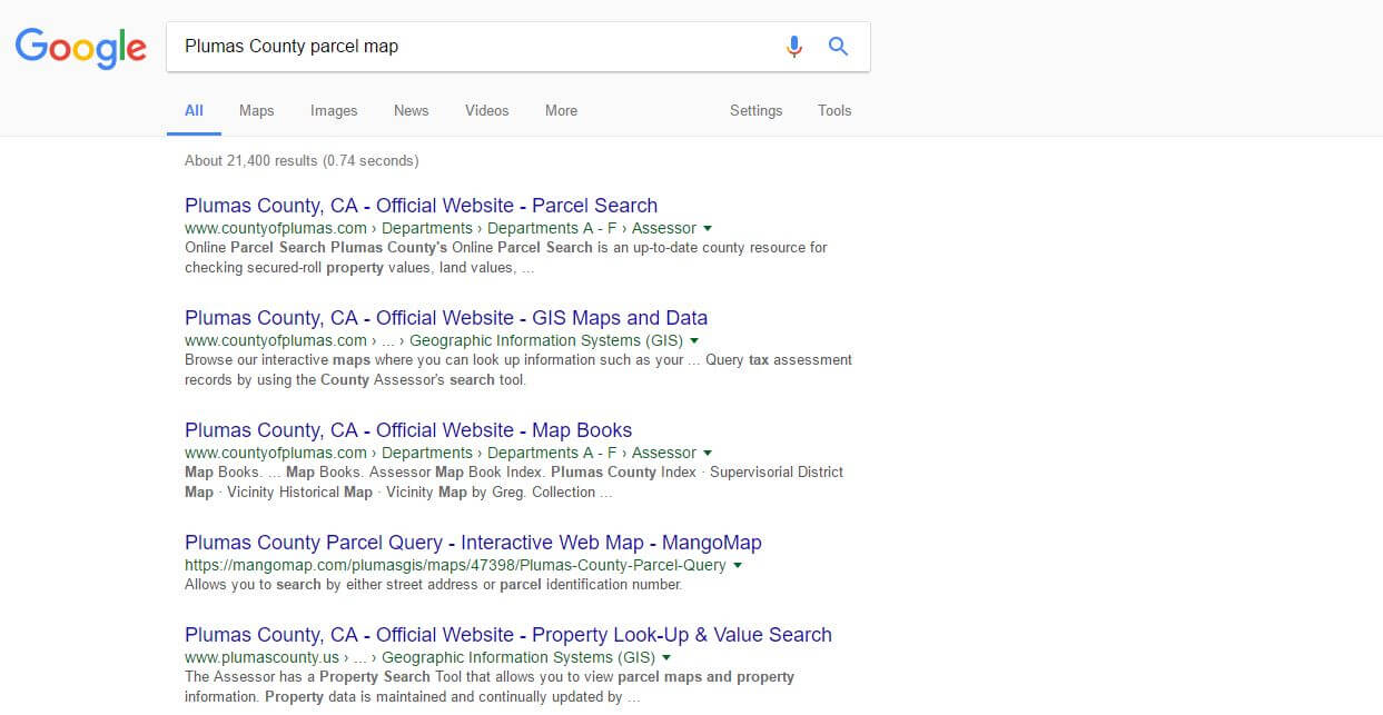
Make Your Map Search Engine Friendly
Google doesn’t magically know what a webpage is about, it uses text to figure out what “keywords” a page is relevant to and as our data at Mango shows us that the majority of map visitors arrive from Google rather than the client’s main website, pleasing the Google Gods is important.
A web map usually contains very little text so we must ensure that the limited text we do have control over is put to good use, that means it should be descriptive. Here’s an example of a bad map title:
Parcel Map
Where is this map? Who is it for?
This is much better:
Parcel Lookup Map for Plumas County, CA
Better yet, we can add a description to double down on our main keywords and descriptiveness.
Search for parcels in Plumas County, CA and access deeds, property cards and tax records.
Now if someone searches for “Plumas County tax records” or “Plumas County parcel map” your site will likely be discovered.
small local governments, from townships to cities to counties underestimate the importance of Google as an access point to their content. The reality is that if your maps aren’t discoverable in Google, they will receive at least half as many visitors and therefore only provide half the return on your investment.
Summary
As you can see, when it comes to producing a high quality parcel map there’s a lot more to think about than simply uploading your parcel data and putting it online. For your map to maximize its potential you need to cover all the bases.
If you follow most of the instructions in this post, you should hit the mark and deliver the ultimate land record maps for your community.