Have you made any of these simple web map design mistakes? In this article you will learn what these common mistakes are and how to avoid them.
If you are in the process of creating a new web GIS system for your county, city or township or are making a decision on whether your current system still cuts the mustard, this article will help you avoid the four most common web GIS design mistakes made by local government.
So let's dive straight in and take a look at mistake number one.
1. Your Maps Aren't Search Engine Friendly
This might seem like a strange one to start with but it is, in fact, the most important, because all of the other mistakes are irrelevant if your potential users can't find your map in the first place.
A common mistake when making maps for local government is to make false assumptions about how your users will find your maps.
And you know what they say about assumptions? They are the mother of all f*******.
I've met with many counties that falsely assume the main route to the map is the user remembering the domain name of their county's web site, typing it into the navigation bar of their browser and then effortlessly navigating through your intuitive multi-tier menu system.
If they have analytics data tracking where their users are coming from, that data might even appear to confirm that assumption. But that assumption is wrong.
Sites that have been optimized for search engines, and enjoy high rankings for relevant keywords will in most cases get more than 50% of their traffic from search engines.
The traffic distribution for a site that is properly search engine optimized should look something like this:
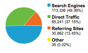
So if your data is showing that nearly all of your traffic is direct, this doesn't mean that direct traffic is working best for you, it means that over half of your potential traffic is never finding your page because it's nowhere to be seen in the search results.
Learning how to search engine optimize your maps to get maximum traffic is too in depth for this post but luckily we've got you covered:
2. Your Maps Aren't Mobile Friendly
So now you've search engine optimized your maps, the next step is to make sure the maps are accessible to the largest number of users possible.
In 2017 global mobile internet traffic surpassed desktop traffic for the first time. This means that if your web map isn't optimized for mobile or worse yet doesn't work at all on mobile, you're going to lose up to 50% of your hard won traffic.
Mobile optimization doesn't necessarily mean having an app, it means ensuring that your interface has been optimized to work in the browser of touch screen devices running Android or iOS (used on Apple iPhone/iPad devices).
Mobile optimized web maps have the following features:
-
The map can be panned by moving your finger across the map
-
The map can be zoomed in and out using a pinching motion
-
The buttons are large enough to be pressing with a thumb or finger
-
The map makes use of mobile features such as geolocation
-
Menu's are collapsed to they don't take up too much of the limited screen real estate
-
Forms are widgets are large enough to easily be completed and navigated using a finger or thumb
-
The map takes up the entire screen area and additional tools and widgets are displayed above the map when required
In addition to mobile optimization, it is also important to consider support for modern browsers. There are many dated web mapping systems, especially local government web mapping system that were created when Internet Explorer was still king.
If your interface doesn't display correctly on Google Chrome, that means it's not displaying correctly for over 70% of your desktop visitors.
And if your web map was built using Flex (as was common with older ArcGIS Server deployments) then your map won't even load for over 90% of users as of 2017.
3. Your Maps Aren't User Friendly
So now let's assume that your web maps follow points one and two in this list.
This means that your maps can easily be found and once they are found work as expected on your user's device, the next step is to make their experience as pleasurable as possible.
Too many web maps try to imitate a desktop GIS, with far too many buttons and far too little focus.
You should decide on the problem that you map is solving before you start building a new map.
The secret here is to always prefer lots of maps that solve a single problem over a single map that's trying to solve every problem.
So a map that contains every single dataset and every single tool is a bad idea. A much better idea is to start with the problem and only add the tools and layers that contribute to solving that problem.
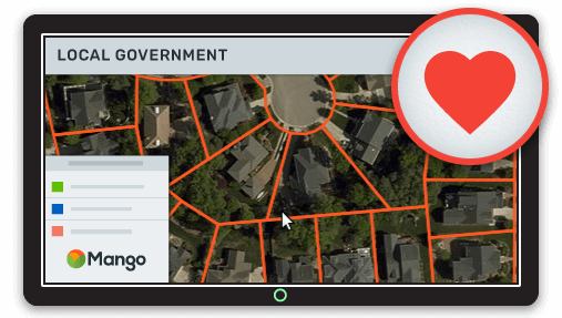
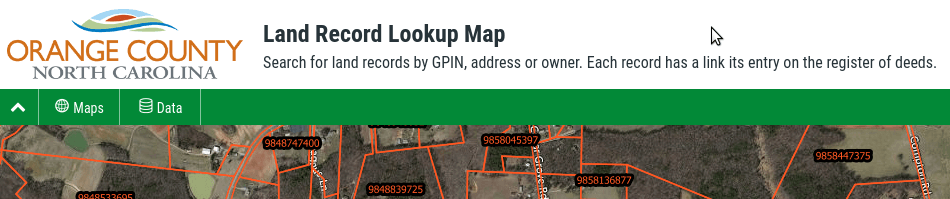
A good example in a local government context is a land records map. So let's start by considering the problem.
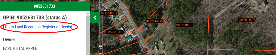
The job of a land records map is to allow the users to quickly and easily locate a land parcel on the map, view the associated information and then follow a link to a page in the deeds record database or make a print of the parcel.
So let's think about what that map should and shouldn't contain.
First is a clear and descriptive name, this will make it easier to find using search engines and also confirm to the user that they are in the right place.
A name like "Orange County Land Parcel Lookup Map" would be a great example.
Next, let's think about the layers that we might include. Obviously, we need the land parcel layer and we could also consider adding a building footprint layer and possibly an up to date imagery layer if that's available.
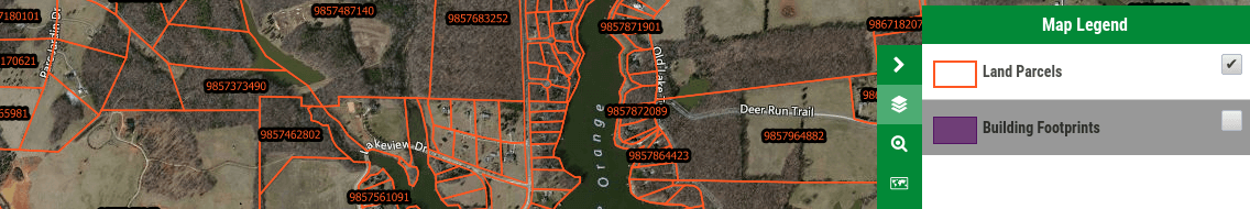
What we shouldn't include is are layers that aren't directly relevant to the problem of looking up land records, layers such as flood areas or zoning for example.
If you have users who need this information then they would best be served by another map that is dedicated to their use case, these maps could also potentially include the parcels layer if it is relevant to that use case.
Next, let's think about tooling. Too many maps have the legend as the default open tool, but in this case, the legend is very simple and it's obvious that the orange (in most cases) outlines are land parcels.
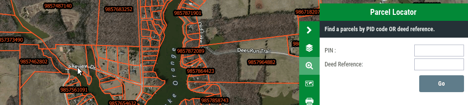
A better choice would be a search tool that allows the user to enter the address, parcel identifier or deeds reference to find the parcel of interest.
We can also add buttons for other tools that are relevant to this use case such as Google Street View, a print tool or possibly a measuring tool.
The last part is making it easy for the user who has found their parcel of interest to easily perform the next action in their workflow. This might be making a print as a PDF, bookmarking the location for future use or to follow a link to the deeds register.
The real secret to a user-friendly design is the concept of 'less is more'. So each time you are considering adding a new tool or new layer you should really be asking yourself whether the new feature or layer will help the user solve their problem more quickly or act as a distraction.
Download our free and super actionable guide on building the ultimate land record lookup map.
4. Your Maps Aren't Operator Friendly
A database is only as good as its data and the same is true of a webmap. You can have a map that's easy to find, works on all devices and is user-friendly, but none of that is of any use if the data is out of date.
This is why it's important to make it as easy as possible for the administrator of the web GIS to be able to update the data and tweak the interface.
In an ideal world, this process would be automated or at least only involve a few clicks in a web browser.
Here are some blockages that should be avoided at all costs when it comes to making changes:
-
Having to write code in order to make changes
-
Having to directly modify a database
-
Relying on a consultant or third party to make simple changes
If it takes any longer than an hour to make changes or involves any third parties it is likely that your web maps will quickly become out of date.
Final Words
There are dozens of elements to take into consideration when creating a Web GIS system that you users and operators will love. Hopefully, the items above will get you off to a head start by ensuring your web maps are discoverable, accessible and a pleasure to use.
If you would like to dig a little deeper into any of these subjects I would highly recommend downloading the bundle below. It contains some great in depth content that's super actionable and will help you implement what you've learned in this article.